Interviews
U N D E R C O V E RExamining Eurythmics Art & Design with Laurence Stevens
Examining Eurythmics Art & Design with Laurence Stevens
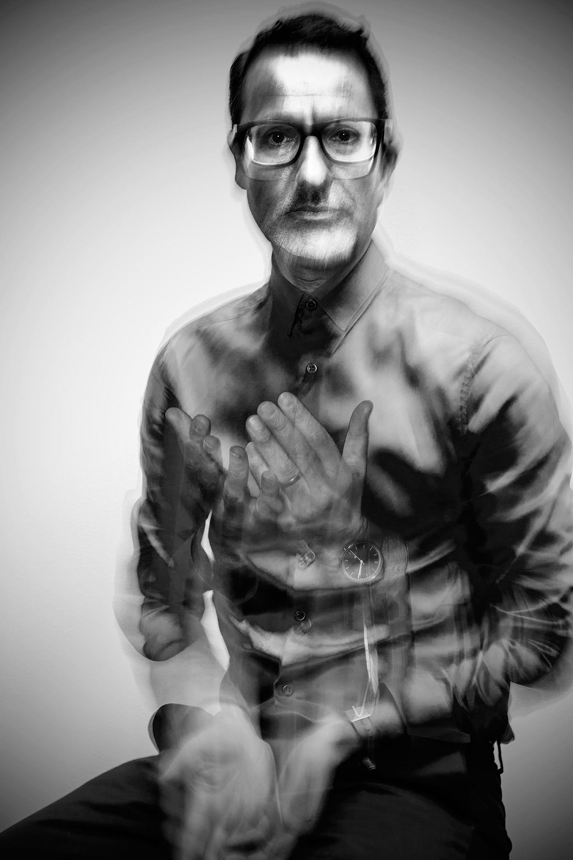
Photographer – Haydn Vooght / © LSD STUDIO 2021
March 14, 2021 – Part I of an exclusive four-part interview conducted by Mark A. Stevens of MAS Communications LLC and Rex Saldaña, Eurythmics Video Visionaries webmaster, over Zoom between the USA & London, England, on Wednesday, 25th November 2020, with Laurence Stevens. Laurence is Eurythmics’ Graphic Designer & Creative Director. Part II of this interview is here at the Ultimate Eurythmics Archives website and Part III is here on this site. Part IV finishes up the interview here.
LAURENCE:
It’s very nice to meet and to see you. Great to hear from you. Tell me a bit about your journalism and your interview process please Mark.
MARK:
I was a newspaper publisher for most of my career. And so now I’m just doing freelancing for newspapers after 30 years or something in the business, which you were very, very influential in, actually. There was always something about your designs that I wanted to emulate. And I’m not sure how to even say that, except, I think one is inspired by design and that you learn from that. I just remember as a younger person – a much, much, much younger person – that I was inspired by what you did as a designer.
LAURENCE:
You know, that’s very nice of you to say Mark. Really kind. It’s taken me nearly 35 years to finally work out what I’m trying to say as a designer. Actually, after all this time I’m really getting to understand typography and design properly, so for the past 35 years I was just really ‘winging it’, as they say!!!

MARK:
Well, I think you’ve done that pretty well. I think that the one thing that I wanted to ask, if you even know, but Eurythmics’ fans, think that your work is intrinsically important to the history of the band. And there is of course the music and the videos. But the design that you did for albums and singles and posters was very important to fans. And I don’t know if that happens with every group. I’m sure there are certain groups that have a sort of an iconic look about them, of course. But are you aware of that with Eurythmics’ fans?
LAURENCE:
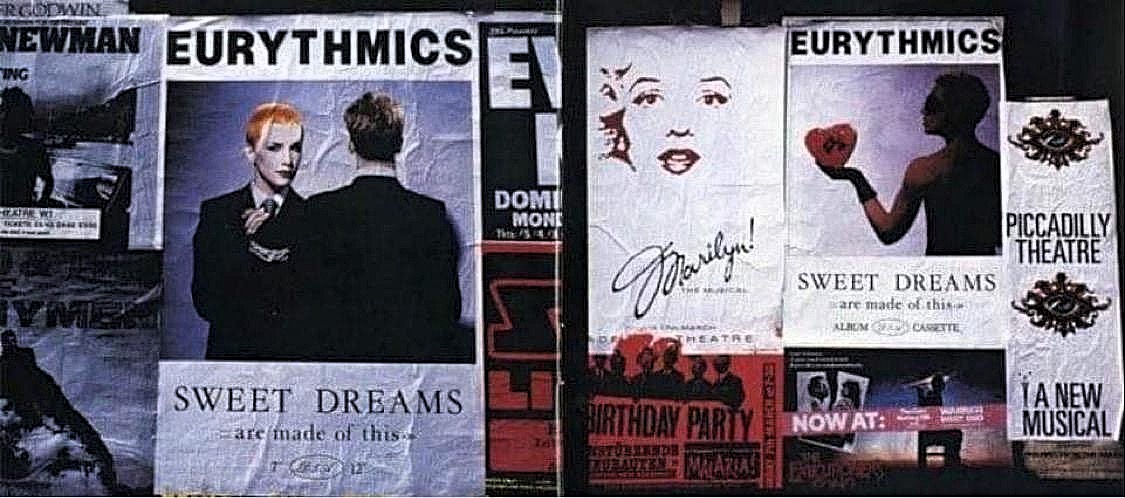
I wasn’t aware of that at all. I’m really pleased to hear that though, because I put a lot of thought and effort into every aspect of Eurythmics’ design, every piece from the single sleeves to the posters, everything. And I just felt it was an incredibly important part of what the band were about and also who they were as artists. And my role was to visually create something that people would see, maybe even before they’d heard about the music, or listened to the new single or the new album. I didn’t set out to create a brand as such for Eurythmics, but to create a strong visual identity for them, which hopefully would become established, you know, lasting the length of time, and have some gravitas and importance to it. So that’s very good of you to say that. You know, there are a couple of designers here in the UK, one in particular is Peter Saville, [who I actually wrote my final year thesis on at art college] who designed all the Joy Division and New Order sleeves. When I was at college, Peter was one of my main reference points and influences, he’s intrinsically involved with the whole Joy Division and New Order ethos, really. It was at that point that I realised the importance of a graphic designer to creating the visual identity of a band or artist. The fact that IMHO, Peter Saville got to work with the greatest band of the 20th century just made their collaboration more important. So yes, I think that it was a situation where maybe it was just luck, or fortuitous, that I ended up designing the single sleeve for “Sweet Dreams [Are Made Of This]” and that it became a success, and then the relationship continued, and it grew stronger, from that point on. So over a period of 35 odd years, it’s quite unusual for a band, or even a product, to have a designer that stays with them for that length of time. As a designer you are also required to create something new for every album that looks and feels different to the previous album, because the band aren’t just writing the same type of songs each time … and obviously Eurythmics have grown visually with their photography, and you also have to create typography that’s moved on as well from “Sweet Dreams [Are Made Of This]”, right up to the “Peace” album for example.
So as I said, it’s wonderful to hear that the fans feel that after all of these album releases that they are aware of a Eurythmics ‘aesthetic and design style’ – so the hard work has definitely paid off!!! I think that’s great that you say that Mark because honestly I did work extremely hard on it all, and sometimes you do take a step back from it and think, does that look right? Is this going to work? You do doubt, sometimes, what you’re doing. So that’s really good of you to say that. Often it would just be myself, Dave and Annie going through everything. There was no one else involved creatively. So I did feel some importance in my involvement, you know, because a third of what I was creating for the band was visual and typographic, which added the final element to the music. So I do think that Dave and Annie actually respected that, which made Eurythmics such a fantastic band to work with for a graphic designer.
MARK:
Yeah, and I read Rex Saldaña’s interview that he did with you in 2005. I’ll try not to repeat a lot of it, but, if I remember correctly, it was sort of by chance, perhaps fate, that you just happened to be at RCA at the same time that Dave and Annie were there to talk about “Love is a Stranger”, is that correct?
LAURENCE:
Yes that’s right. I met Dave and Annie for the very first time in September 1982. I had completed my BA Hons graphic design degree at ‘London College of Printing’ earlier that year. I had been in a couple of bands so I was really involved with music, maybe even more so than design at that time. I was in a band called ‘Blancmange’ and we were just starting to get noticed. But at the same time I won a place at art college, and I do remember thinking ‘what are you going to do’? I realised that I needed to really concentrate and take it seriously if I was ever going to move forward with my art + design, so I left the band and accepted the place at art college. Typically, three months later ‘Blancmange’ were offered a deal and signed to London Records, and then went on to have a massive hit with “Living On the Ceiling”. In the meantime, I’m stuck at college learning how to hand-render 12 point type with a pencil … wondering if I’d made the right decision or not!!!
So I left college in May ’82 really determined to design record sleeves. At that time, record companies had proper art departments, so I spent all my time trying to get to them to view my portfolio of work. But after a while of doing this, making appointments, seeing the various art directors at the record companies, I realised that if they’d got a good artist, or a cool band that needed a record sleeve designing, that realistically they weren’t going to offer it to me straight away – even though the feed-back from the art directors viewing my design portfolio was always very good – and of course, I didn’t just want to design a record sleeve for any band. So I thought if I can somehow present my design work directly to the artist or band, and bypass the art department, as it were, you know that might be a better option.
So after quite a bit of time, instead of making official ‘portfolio appointments’ I decided that I would walk straight into the record companies, find out where the A&R Dept was, show them my work and see if that was a better way to get the bands to view my portfolio. So the first record company I decided to try this plan on was RCA Records. I was, and still am, a massive fan of Bowie so RCA Records seemed like the perfect place to start. So to cut a long story short, I literally walked into RCA. In those days, you could just walk into any company really, you know, there might have been a doorman, but there was no password or entrance code, or sometimes not even a receptionist or barrier to go through. You could just walk in, so I walked into RCA Records, got into the lift, and took my portfolio up to the 4th Floor, followed the sign to the A&R Dept, and waited there to hopefully show somebody my design portfolio.
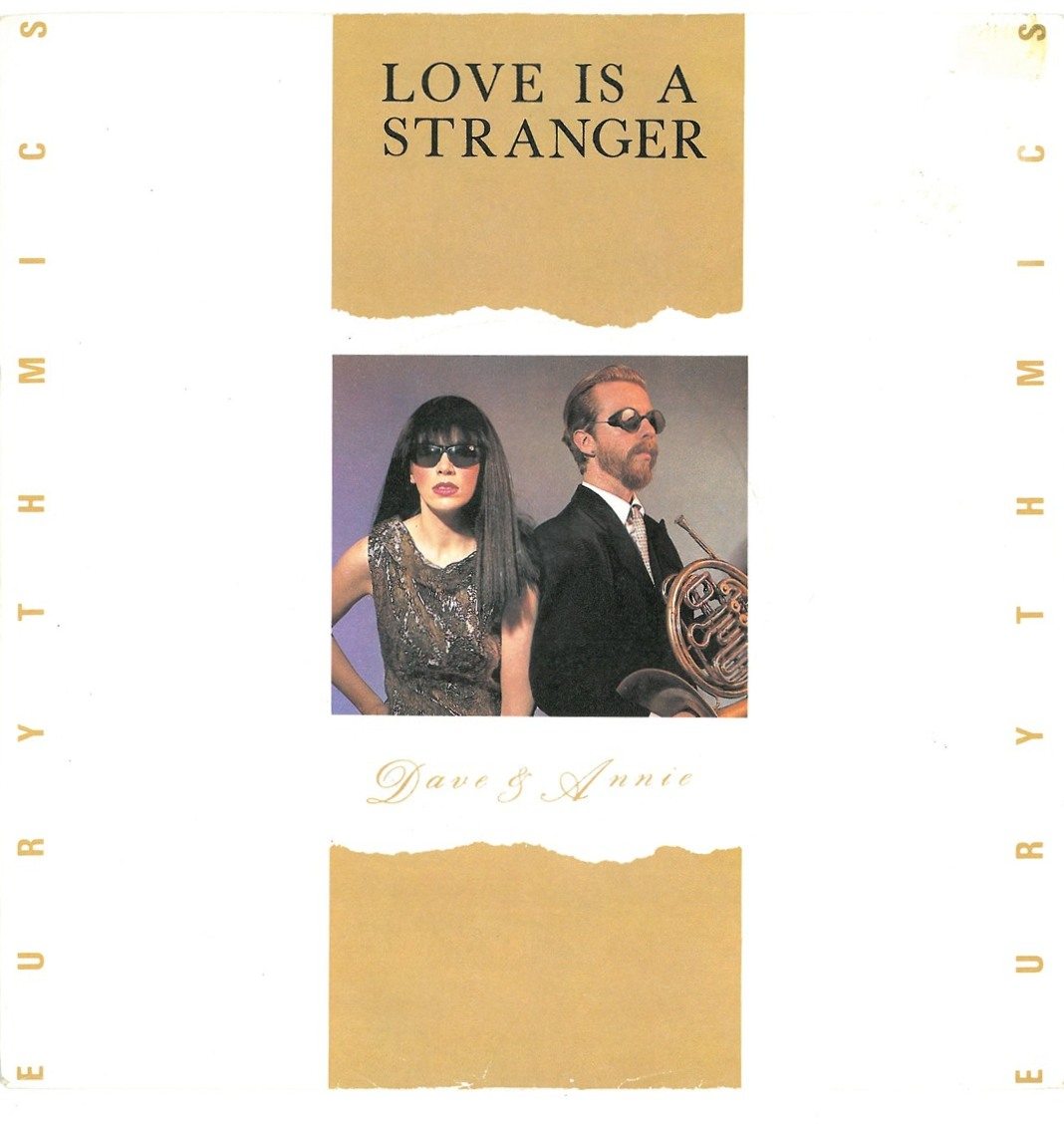
As fate would have it, Jack Steven, who was Dave and Annie’s A&R guy, came out of his office and said, “Hey, who are you?” I just explained to him, something like, “I’m a graphic designer. I’m interested in designing record sleeves, and I’ve got a portfolio I’d like to show someone.” So he said, “Well, why don’t you come in now, I’ve got a band with me, we’ll have a look.” I went into his office, and Dave and Annie were just sitting there. I was obviously aware of Eurythmics, and of course The Tourists, in fact at the beginning, people at the label found it hard to pronounce the word Eurythmics so they were often referred to as ‘Dave and Annie from The Tourists’, and that’s exactly how Jack introduced them to me. I just showed Dave and Annie my portfolio, we started to talk about music … I really liked them straight away. They just said, “This is great, we’re releasing a single called “Love Is a Stranger” and we need a sleeve designed in couple of weeks.” So that was it, finally I’d got my first record sleeve to design, and I do remember thinking “thank God it’s for a cool band”. But, I’d never produced or created any professional industry standard commercial artwork before. So I did think, ‘bloody hell you got what you wanted, but how the hell are you going to do the typesetting, create the printers films, produce the board artwork, etc.’ I guess that’s the wonderful innocence of youth, you just go for it and ask questions later.
Actually, going back to what you said at the start about the bands’ visual identity. I didn’t really think about the fact that Eurythmics had already had an album out the previous year, and that they’d already released “Never Gonna Cry Again” and “Belinda” as well, obviously I hadn’t designed either of those sleeves. I hadn’t designed the “In the Garden” album either – I actually bought that album when it came out in October 1981 because Conny Plank had produced it – but instantly I just kind of naively, or perhaps arrogantly, in a way, just thought, I’m not going to take on any of that stuff, you know, I’m going to design a brand new logo for them with a strong typographic feel and we need some stronger photography. Dave and Annie were just great to work with, they were just so positive about my design ideas. They just kind of trusted me I guess and let me get on with it. Obviously, I would present my visual ideas to them both and they would say, “Yes, I like that or I like this idea.” And we just kind of built it up from there, really. “Love Is a Stranger” was the first professional, ‘proper’ graphic design job I ever did. I had obviously produced printed flyers for college bands and friends, but “Love Is A Stranger” was my first ever record sleeve, so I will always be extremely thankful to Eurythmics for offering me my first record sleeve design job!!!
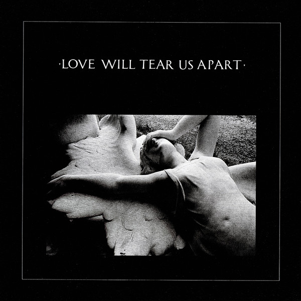
And then after that, they then released “Sweet Dreams [Are Made Of This],” so I designed that single sleeve as well, and then it just took off, you know. So when I designed the single sleeve for “Love Is a Stranger,” I didn’t know “Sweet Dreams [Are Made Of This]” was going to be the next single. But I had in my mind that the logo and the graphics, and the typographic treatment would work from “Love Is a Stranger,” so whatever the next single was, if you put them together, you can see the DnA logo and the use of the imagery and stuff, and the Palace Script typeface that I used on the back of the sleeve. I was already thinking of a [continuity] body of work for those single sleeves even at that point.
But it was fantastic on everyone’s count, really, because if “Sweet Dreams [Are Made Of This]” hadn’t been a hit, you know, Eurythmics might not have continued with the label. They were really, you know, on the edge, as a lot of those acts are. But, you know, if it wasn’t a hit, they might have then got signed to someone else, some other designers, other photographers would have worked with them …. But, luckily for all of us, it was a hit, and we kind of moved on together as a team from there.
I just felt that I really kind of understood, as much as I could do in those first initial meetings, what Dave and Annie had been through, what they were trying to achieve. I kind of felt that I was on their wavelength, really, and thinking, well, if this was me, this is what I would do visually, you know, this is what I would do for them. And also, I felt that with “Love Is a Stranger,” I designed that and worked on that and pushed for the fly posters and press ads even at that very early stage, thinking “Well, we have to treat this as though it’s going to be a hit. We have to think about it properly.” They’d had three singles that hadn’t been hits and this was like, well, let’s just do it. I always felt this was really important. If we’re going to do it, we have to do it really well, because I felt that the music that Dave and Annie had produced was just so great. Ha! can you imagine what I felt hearing Dave play me “Sweet Dreams [Are Made Of This]” for the very first time … So luckily “Love Is a Stranger” did enter at the lower end of the charts, and then when “Sweet Dreams [Are Made Of This]” happened, it was great that we had all thought about the fact that if this is going to be released, we need to make it look great, because it could be a number one, you know, it was that kind of vibe. And we just did that all the time, really, on my part anyway.
MARK:
I’m curious about the way things came out. Of course, there was the single “Love Is a Stranger,” but when did the album come? The design for the album, the album release – in that sense was it “Love Is a Stranger,” then the “Sweet Dreams” single? And then the album? What do you remember in that order?
LAURENCE:
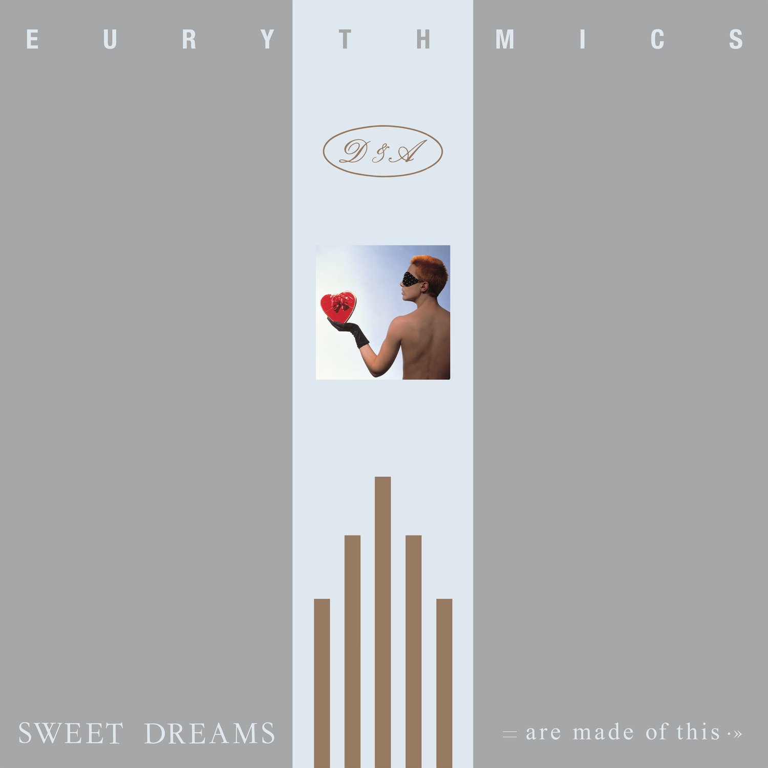
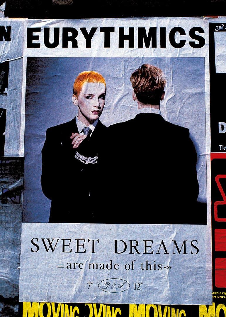
Yeah, the “Love Is a Stranger” single was released in October ‘82, exactly 4 weeks after I’d first met Dave and Annie, and then the “Sweet Dreams [Are Made Of This]” single was released in January 1983, but it was obviously recorded in the previous year. The photographs and images that I worked with to create the “Love Is A Stranger” design campaign, as well as the “Sweet Dreams [Are Made Of This]” single sleeve were actually shot in 1982 by the photographer Lewis Ziolek. As far as I remember we just did the shoot, with a few different set-ups, not really knowing which images were going to be used for what formats. We just really worked on the visual ideas on the day of the shoot. Both Dave and Annie were just great to work with, we just tried out any suggestions or ideas that anyone had at the time, if it looked great [checking the polaroids] that was cool, if not, we simply moved onto the next shot. It’s crazy to think that that first photo shoot I did with the band was just myself, Dave and Annie and Lewis the photographer … no make-up artist, no hair stylist, no manager, no-one from the record company, no assistants, no stylists, no PAs etc … little did I know that within less than a year I’d be working on shoots with Dave and Annie and there would be at least 25 people in the photographic studio!!!
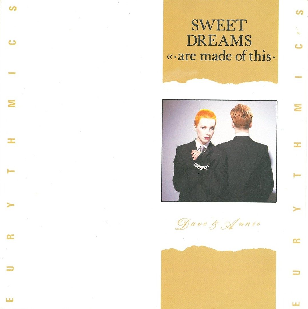
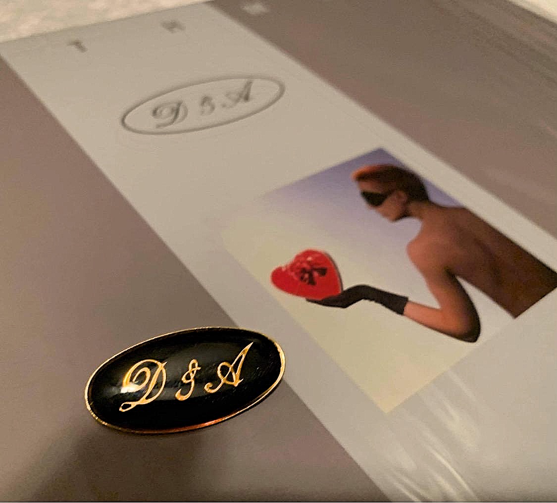
I think it was either Annie or Lewis, that had the idea of the ‘chocolate box’ shot, thinking, “Well, that kind of sums up ‘Sweet Dreams’ in a box in a way, you know?” So, instead of it being like a huge image, obviously, I just kind of thought it’s a kind of sweet personal thing having it as a Polaroid type of image, you know, really small on the sleeve.
MARK:
I think, again, it comes back to your specific genius in the design that a lot of people may not have. If they’d had that image, it would have been so easy to say, “Oh, well, that’s the full album cover.”
LAURENCE:
That was just my belief and thought process at the time, it still is really – ‘less is more’. You can tell I’m a minimalist graphic designer in a way, I like to use typography, maybe a lyric line, or even just the name of the band mixed with strong photography, those are the main elements that I tend to use and that I’ve used throughout my career designing record sleeves. You know, if both the image + typography are good, then the product visually is going to look good. Also with the “Sweet Dreams [Are Made Of This]” album, the tracks sounded really amazing. I felt at the time that Dave and Annie had created a brilliant piece of work, obviously no one knew how successful it was going to be, but it really did sound different to what Culture Club, Duran Duran, Spandau Ballet etc…were doing at the time, so I wanted the sleeve and graphics to look different too so that it stood out from everything else. I remember talking to Dave at the time and discussing the ‘genre of music’ that they’d created for this album, so that the press could describe it, and Dave came up with the fabulous title of ‘European Electro Soul’ to describe their new sound. In fact I do remember designing a small logo with this title to possibly use on the album sleeve. Obviously the album sleeve had a number of European, Modernist design references to it, including a bit of 1930s art-deco style as well. I created a number of design visuals for the album sleeve cover – but always using the small ‘chocolate box’ image. I remember showing the initial visuals to Annie and I think I had used the columns, which appear on the cover, in a different idea for something else. Annie maybe said, “Actually, maybe we could use that and have them gold on the front, you know, rather than black?” And so in those early days, we were working together and trying to work it all out really, I found that process really exciting.
So I’d really created a visual style with a typographic treatment that they liked, and which I felt suited the product that they were releasing. The original thought that I had was that the first singles and then the album, the type style, the logo etc. all needed to look the same in order to create a complete body of work. A lot of the other acts at the time that I began to work with, would say this is the single title and this is the band logo, so we’ll do something for this single, then for the second single we’ll change it for this and change for that, which as you can imagine wasn’t the way that I worked or saw things as a graphic designer at all !!!
The ‘brand’ idea is a very ’80s kind of thing I guess, but I always felt Chanel or Christian Dior, or, you know even the BBC, they just retained that strength of their logo throughout. And that’s what I tried to achieve with the DnA monogram that I designed from the start. You know, the DnA oval logo that appeared on the early sleeves and vinyl labels, and even on some of the posters. It was a way of getting rid of the awful ‘Dave and Annie from the Tourists’ tag-line, but still having their initials on Eurythmics product moving forward, a transition if you like. So it was really thought out, but not in the way that I would do now. It was just we were feeling our way really to see what kind of worked. And I think, again, because of the fact that “Sweet Dreams [Are Made Of This]” was a hit, we thought, “OK, people are definitely liking the music, and they seem to like the style of the design + typography, so we need to carry on along this way, along this route”. We obviously never discussed this, but I guess it was a subconscious thought that we all had that we were doing the right thing, at the right time.
MARK:
Yes. You even mentioned the little DnA logo.
LAURENCE:
It was going back to what I was saying about people talking about them as ‘Dave and Annie from The Tourists’, which then became ‘Dave and Annie have a new band called Eurythmics’, and it was such a mouthful. All of this, you know?
They had created a company called DnA, which was their publishing company, and I wanted to have some reference to their names on the packaging that I was designing for them, which became part of Eurythmics. So it was a personalisation of Eurythmics as one big kind of word, because at that time, if you just saw Eurythmics on a bus, you would you’d have no idea what it was, just the type on its own. So the idea of having a DnA monogram with it, and then the images of Dave & Annie within that visual design, kind of made sense. Also I was trying to make the logo look very legal and established, and quite serious, as well, which was part of the design ethos within that early ’80s period. We’d come from a punk period where everything was purposely very scratchy, messed up, ripped up, collaged and kind of ‘sacrilegious’, really.
And now in the ’80s, without getting too political, we had, Margaret Thatcher as the prime minister of the UK. People were starting to have and want more money. Young guys and young girls wanted to be more, what’s the word, aspirational. They were looking towards better jobs, better money, being more affluent, I suppose. The DnA logo was a kind of touch to that in a way to make it look more corporate. We had a big department store chain in the UK that had been around for 50-60 years, which was just about to go bust, and it was called C&A. I remember walking out of RCA Records down Oxford Street, in London’s West End, where they had a closing down sale and they had a big gold oval with the C&A logo in the window, and I just kind of thought, “OK, well, they’re closing down and Dave and Annie are now just starting and maybe it looks like a kind of a corporate established kind of mark. Maybe I’ll take that and make it DnA.” I used it on all of their vinyl labels as well, in the early stages, just to give all the product a more personalized visual identity.
Part II of this interview is now live on the Ultimate Eurythmics Archives website here. Parts III & IV can be found under our Features section in the main menu. Be sure to check out LSD STUDIO’s new Instagram page here.