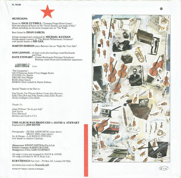
Interviews
U N D E R C O V E R
Examining Eurythmics Art & Design with Laurence Stevens – Part 4
June 29, 2021 – Part four of an exclusive interview conducted by Mark A. Stevens of MAS Communications LLC and Rex Saldaña, Eurythmics Video Visionaries webmaster, over Zoom between the USA & London, England, on Wednesday, 25th November 2020, with Laurence Stevens. Laurence is Eurythmics’ Graphic Designer & Creative Director, a unique partnership and collaboration that has spanned 40 years, something unique in the music industry.
In Part 1 of this interview, Laurence discusses his love for graphic design and how he started in the record sleeve design business, and how he came to work (by chance) with Eurythmics and the creation of the designs for the initial singles “Sweet Dreams (Are Made of This)” and “Love Is A Stranger”. Part 2 focused on the design concepts for the “Touch” and “1984 (For the Love of Big Brother)” albums and singles. For Part 3, Laurence discussed the albums “Be Yourself Tonight”, “Revenge” and “Savage” and the design concepts he created for those projects.
Now we’re pleased to present the final part of this interview where Laurence discusses, amongst other things, the subway/fly posters (which have become quite collectible in recent years), how picture sleeves can vary from region to region (often without his input) and the elusive “King & Queen of America” Presidential Sleeve, which you might be surprised to hear Laurence’s comments about – all of this in part 4 below. Click on any of the images in this interview to enlarge and see more information.

MARK:
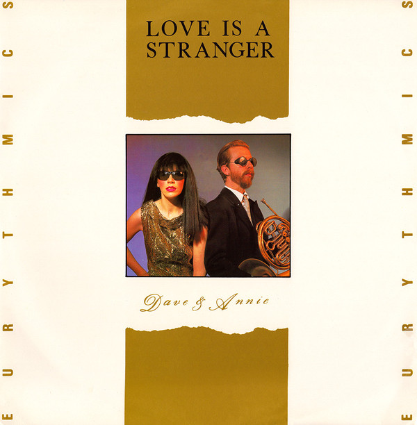
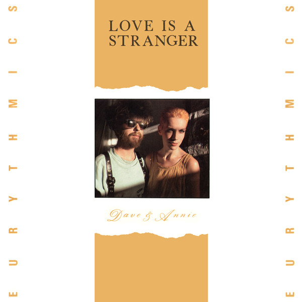
Let me ask you really quick as I don’t know how this works, so you’ll have to enlighten me. I know you design the single sleeves and the album sleeves, but then different countries will sometimes have the same sleeve, or a slightly different sleeve, or a totally different sleeve. I’m thinking “Love Is a Stranger,” for example, here in the US. Same design, but the photo was different. Are you involved in that aspect when it comes to this country, whether it’s RCA, USA label? In particularly, “Love Is a Stranger,” were you involved in that photo being changed?
LAURENCE:
No, and that’s a real cause of obsessive anxiety for me. It’s a good question. In the early ’80s, and even in the early to the mid ’90s, you would produce board artwork, manually, pre-digital, which is cut and paste, if you understand what I mean? You know, you have an artwork, and you have the photograph on a board and you’d have an overlay with the logo on top of it, and place where the title was going to go, everything I did was pre-digital up to this point. So the record company would make films of the artwork that you gave them and those films would be generated into metal plates to print from.
So the record company would send those films off to the different territories. And really the territories should have just printed those films as they had been sent, which from my point of view as the designer would mean that the record sleeve or poster, or point-of-sale display board, was the same in all the territories.
But sometimes the B side would change, for example, or they would do a different mix or the catalogue number would change or it wasn’t going to be on RCA in Italy, it was going to be on a different label, for instance. So they had the films, and they would cut those films up and reposition stuff. And if they had a different press image that was already approved, someone would say, maybe we’ll make our sleeve different and drop this image in instead of the other one, you know?
So I mean, I’m just talking about how the process worked at the time, but I had no control over that at all. It was just completely, you know, the Italian label, the American label changing stuff. Some of it worked. Some of it keeps me awake at night, you know? I mean, just the way they would make the DnA logo way too big. And then the Eurythmics type logo really small, and all that – it completely drove me mad. But because it was a success, we just went with it, but obviously it was great to get the stuff out there.
But at that point, I had no control over what other territories did with my designs or final artworks. Now, we do digital formats that get signed off and we supply that to the labels and when they supply any changes of track listing, we do that and then supply the digital artwork. At that point, you couldn’t send out 14 different board artworks and different films to different territories. It was just impossible to do. Digitally, you can do that now. So yes I do see Eurythmics stuff all the time, from Australia, Brazil, Greece etc … where I think “WTF happened there, why did they think that to change the image was a good idea?”
You know, like Rex Saldaña sending me the picture of the ‘Touch Dance’ poster that he bought. I get people sending me things saying, “Have you seen this from eBay”? And I’ve never seen it before, you know, an Australian release or Japanese release with a completely different image on the cover. Brazilian picture discs. I mean, I designed it all, and I can’t keep up with it. Well, you know, in fact, some of the fans actually do a better job than I do. And so, yeah, that was something that I had no control over, really. And also, Dave and Annie, when they would go to some of the different territories and they were asked to sign something, they actually saw the changes that they hadn’t even seen before too.
MARK:
Yes, I know. They’ve often said to people, “Where’s this from?”
LAURENCE:
Yes, of course.
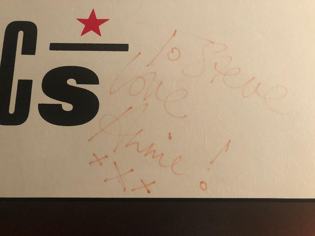
MARK:
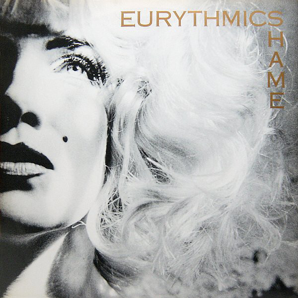
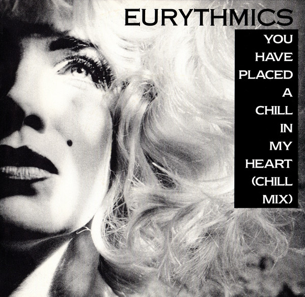
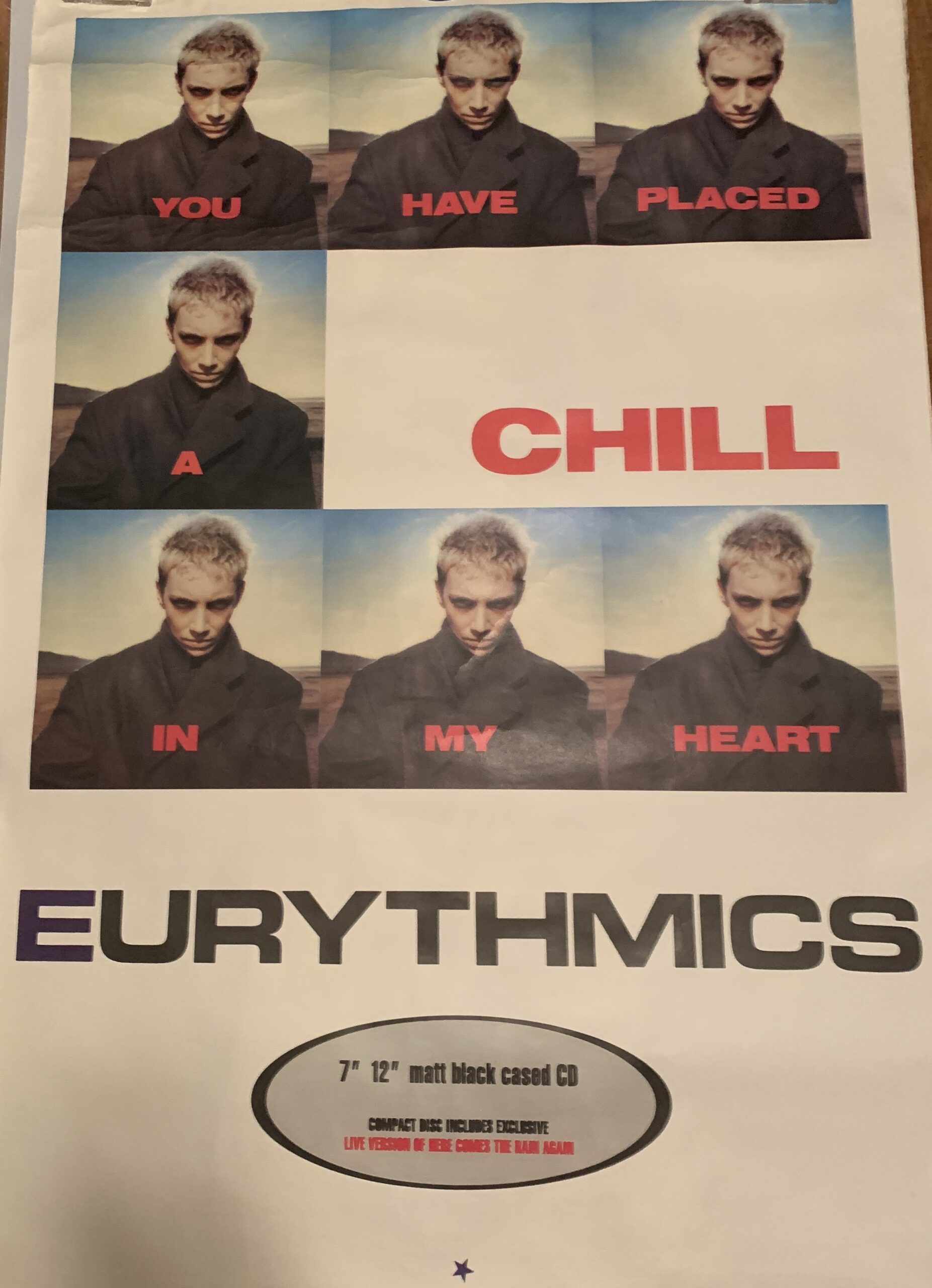
There’s one single that came out in 1988 in the U.S., “You Have Placed A Chill In My Heart (Chill Mix)”. It apparently started with the album version and then the record company changed it to the Chill Mix. The sleeve they used was the one that you designed for “Shame” in the UK. But the title of the song was in reserve type in a black box down the right side. Even at the time, I looked at it and said, “Someone’s taken that and re-done it, and it’s terrible.”
LAURENCE:
I have seen that, and as we say here, “It’s a dog’s dinner”. It was just dreadful. The ironic thing about that particular sleeve for me, was that “You Have Placed A Chill In My Heart” sleeve design, won the Music Week Design Award that year for the Best Single Sleeve of the Year. So to have won that, and then to see another territory, particularly in the U.S., not only change the cover image, which was such an integral part of the design, but change it for another single sleeve image, it was just terrible, you know, but what can you do?
REX:
The “You Have Placed A Chill” sleeve with the Polaroids. That’s my favorite sleeve of yours that you’ve done with Eurythmics.
LAURENCE:
That was a wonderful still image taken by Sophie Muller from the video that she directed. I sat down with Annie when she was living in Paris at the time, and I had some initial ideas which I presented to Annie. I do remember that she was just moving the polaroids around on the table. I was trying to work it out because it was such a long song title. How would this fit? Annie was moving the pictures around and the final layout just kind of revealed itself — why don’t we use repeats of the Polaroid and then make the word CHILL the biggest aspect on the sleeve?
What you were saying earlier, Mark, is very interesting concerning the importance of the graphics and the designs that I created for the band. Winning the ‘Music Week Design of The Year Award’ in 1988 was the first time that there had been any validation or acknowledgement about my design work, especially from my peers. So I did think at the time actually this award is about the sleeve design, not about the band or the music, it just confirmed to me that what I was trying to creatively say design-wise, and typographically in my work had finally worked and got through to people.
As we know awards are meaningless, whether you win them or you don’t win — Christ, both Dave and Annie have won too many awards to even remember … But back to your question about the Chill Mix sleeve, I really remember thinking that for the U.S. to change the cover image, was just horrible, really stupid and actually rude to me as the designer and especially to the band. It was completely horrible. And funnily enough, I didn’t even actually get to see the physical sleeve until years later.
MARK:
So we’ve moved into this digital age where people download. But albums or LPs, rather, have made a comeback and you can hold them. But there was a little bit of period there when CDs were going out and albums were gone and digital was coming in. And the stuff that you do – the designs – are now a tiny little image on iTunes or something, and I wonder how that played with you.
LAURENCE:
It’s a really good point. In the 2000s, I used to say that I’d gone from designing album sleeves that were 12 inches square, now down to 12 centimeters square for the CD sleeve, and now it was 12 millimeters square on iTunes, and eventually it was just going to disappear! The album sleeve was just going to become a white dot on the screen. In around 2000, a lot of labels in the U.K. had sold their pressing plants – you know, the vinyl-making machinery and cutting machinery, because they thought that ‘vinyl was dead’. Ironically a company called GZ Media in Czechoslovakia bought up most of the UKs vinyl-pressing equipment at the time, and funnily enough when we re-did all of Eurythmics vinyl sleeves again for the re-issues in 2018, I ended up going out to the new Czech Republic to oversee the pressing of the re-issue albums and the printing of the sleeves, on the very same equipment that we’d used originally all those years ago in the 1980s.
My love of the 12-inch vinyl album sleeve, it’s in my DNA, pardon the pun! So yes, it was definitely a big shock for me as a record-sleeve designer when we all thought that the 12-inch vinyl record was going to be no more. During the CD era in the 2000s and now the digital download era, artists and bands still need a visual identity, even if it looks a lot smaller on screen. The feeling that I got, or that you guys got when you bought a 12-inch vinyl album or even a CD and you opened the booklet – most ‘download kids’ today have never really experienced that. And therefore, it wasn’t something that they missed because they were now streaming music or downloading music. So they had known the vinyl in their parents’ collections, and you know, it was kind of cool, but it didn’t fit on their iPhone or laptop or however they were listening to music. So I understood the process of it, but I really felt that we lost the importance of the art of the record sleeve design in the process. Record sleeve design per se isn’t an industry I know, but a section of the music industry that had grown and was just as important. You know, the Bowie, Lou Reed, Clash, Joy Division album covers, and all the hundreds of album covers that I saw as a kid, those album covers became really important for those artists. You know, to the extent that the Stones still use John Pasche’s original ‘lip logo’ design 50 years later – that’s nothing to do with the music. That’s just a piece of wonderful album design that has become the main visual identity of that band. Record sleeve design IS really important, and I felt that the social importance of it, even in the CD era, had definitely started to diminish within the industry.
Peter Saville, who I mentioned earlier was Joy Division’s sleeve designer, is a really fantastic graphic designer. He said that designing for music after the age of 30, you shouldn’t be designing for bands, and I felt at that point in the 2000s, maybe this is the time where music is changing, and it’s going to a much younger audience, and younger designers, and younger photographers. But it continued, you know, my love of music design. If you look at various Instagram sites, with all the different new designers and new photographers, it’s always, #musicdesign, #designformusic, # albumcover. It’s a genre that won’t go away. It’s really important. Now, there are books and exhibitions just on record sleeve and music graphics design. So it did dip in that decade in between say 2000 to 2010, I agree, and a lot of the 12-inch vinyl design reissues that the labels released at that time, were just really bad reissues and dreadful scans of the original sleeves because no one had the original artworks to reproduce from anymore – the record companies in their wisdom had thrown all of the original board artworks away of some of the most iconic record sleeve designs in the world – imagine throwing away all of the master tapes for every album that The Beatles released – FFS!
So they just scanned the original sleeve and re-released it and it just looked crap. It was just really bad. At the end of the 2000s, I think the labels realised how important their back catalogue was and that, for fans, if they were going to reproduce that sleeve, it had to be reproduced really well on better quality paper, there had to be a booklet or a written lyric sheet or something from the artist or some photographs that hadn’t been seen before in order to make that $100 album package worth buying. That was the thing. So they eventually had to get their act together.
MARK:
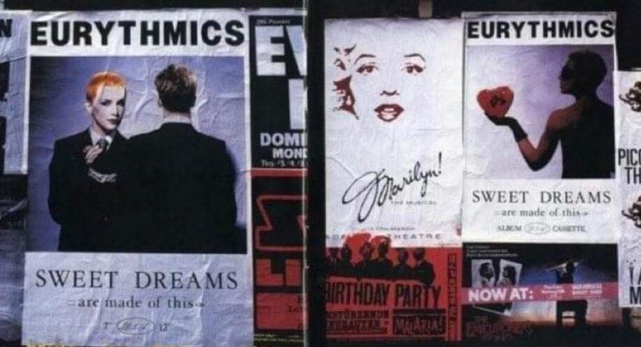
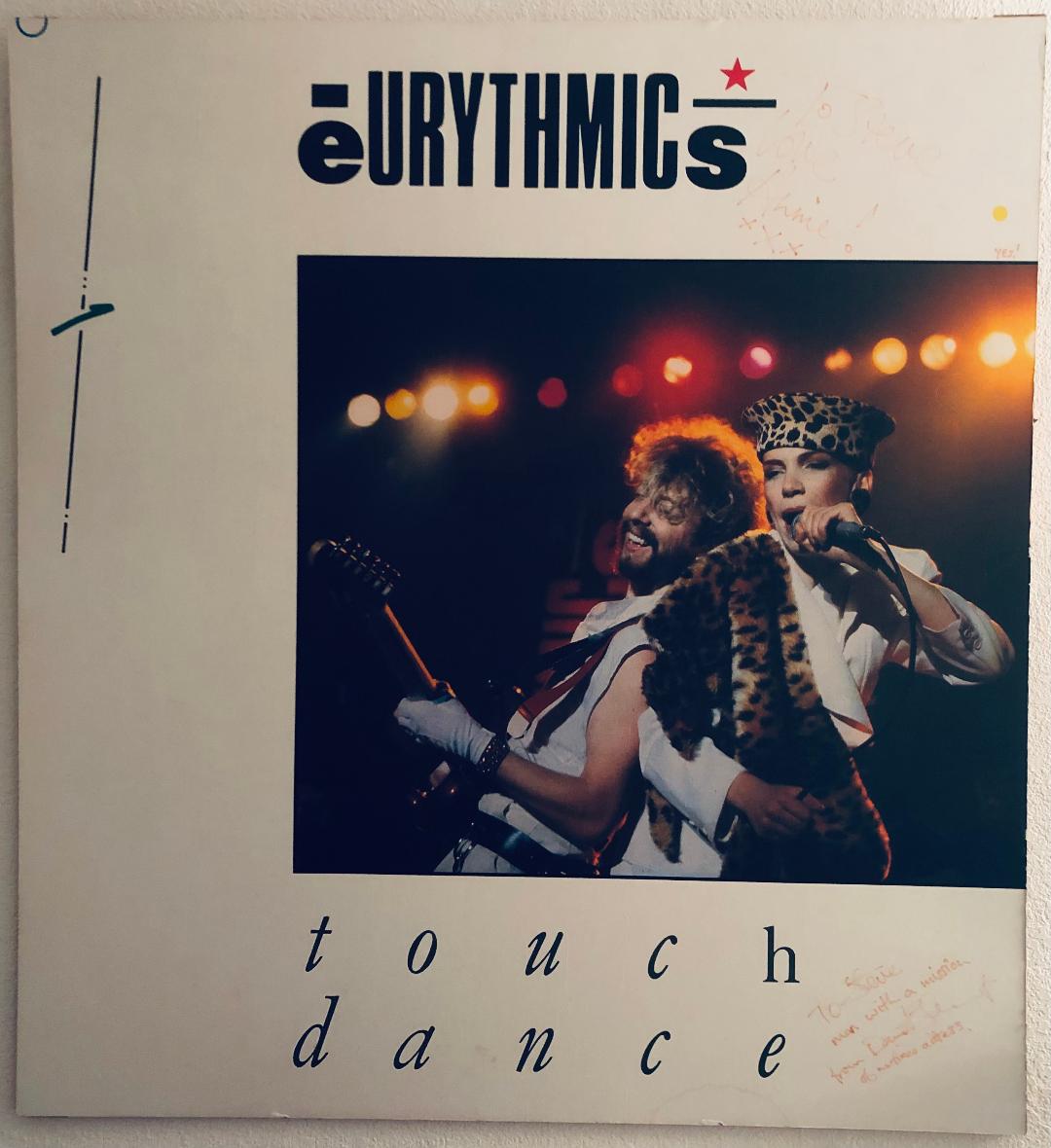
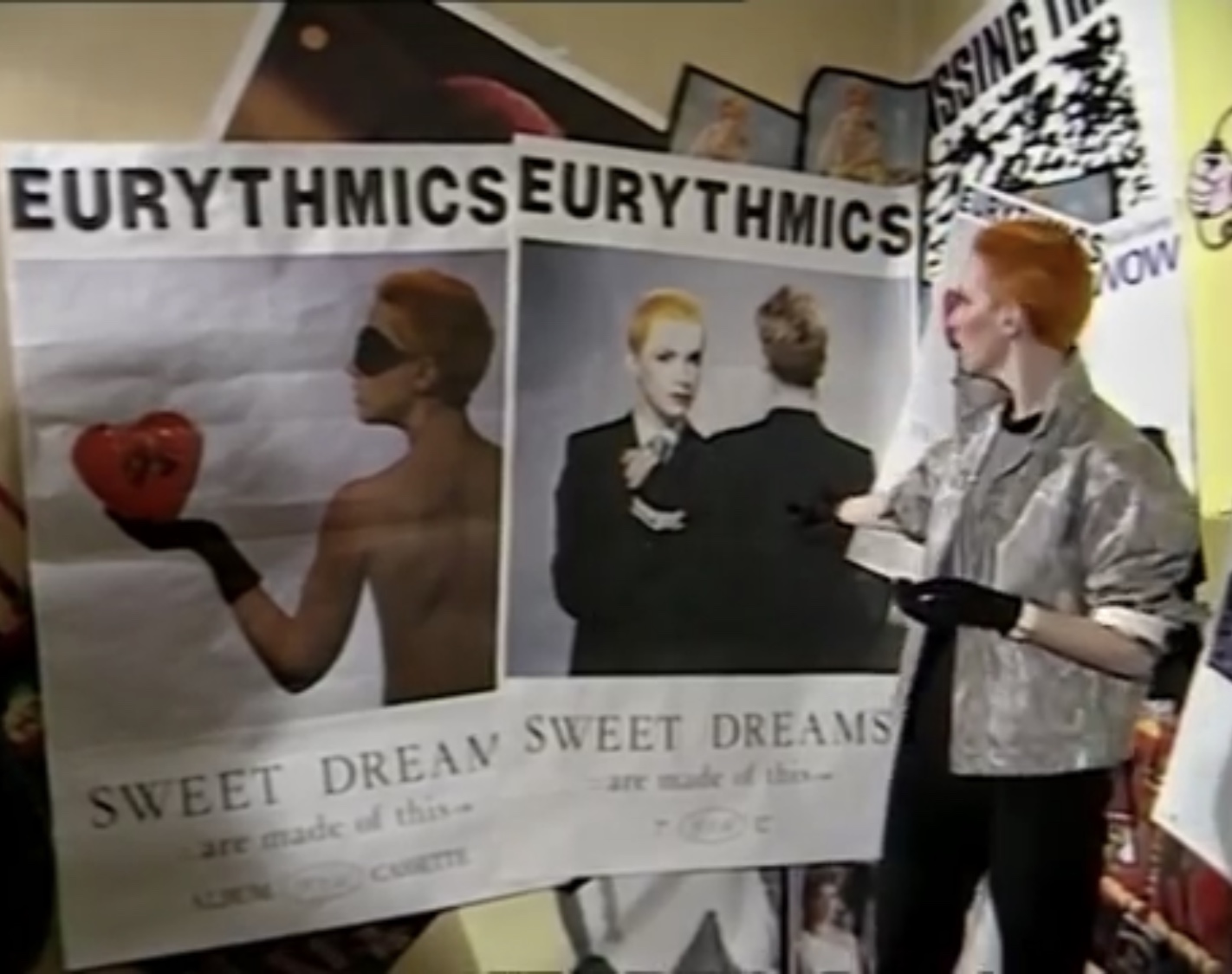
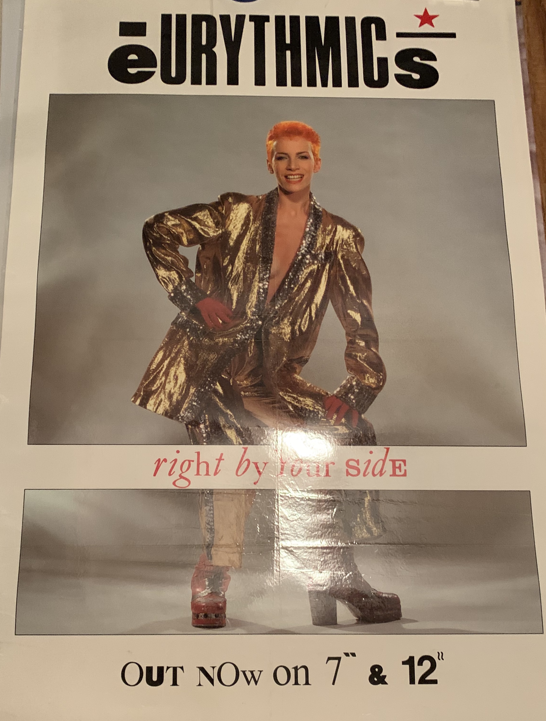
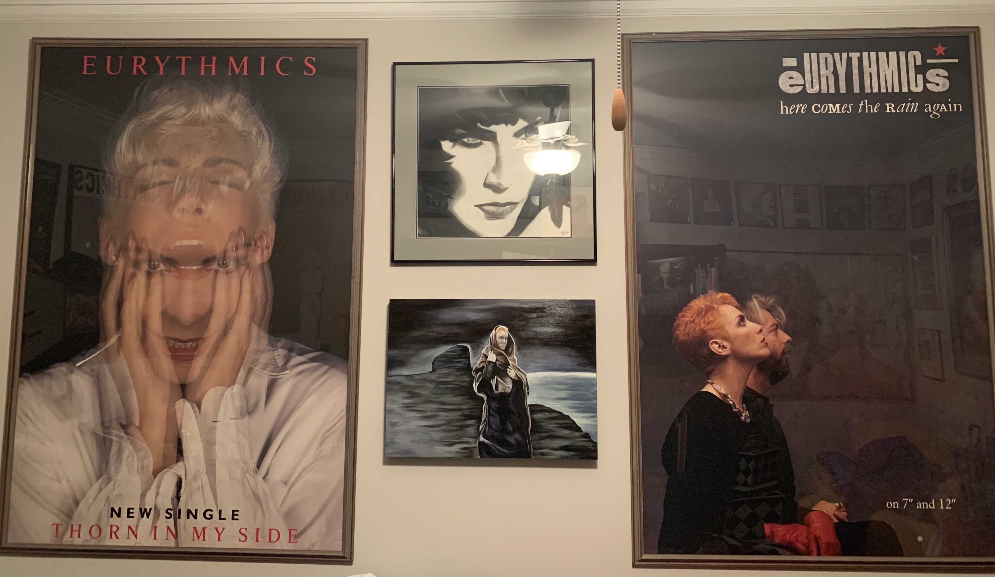
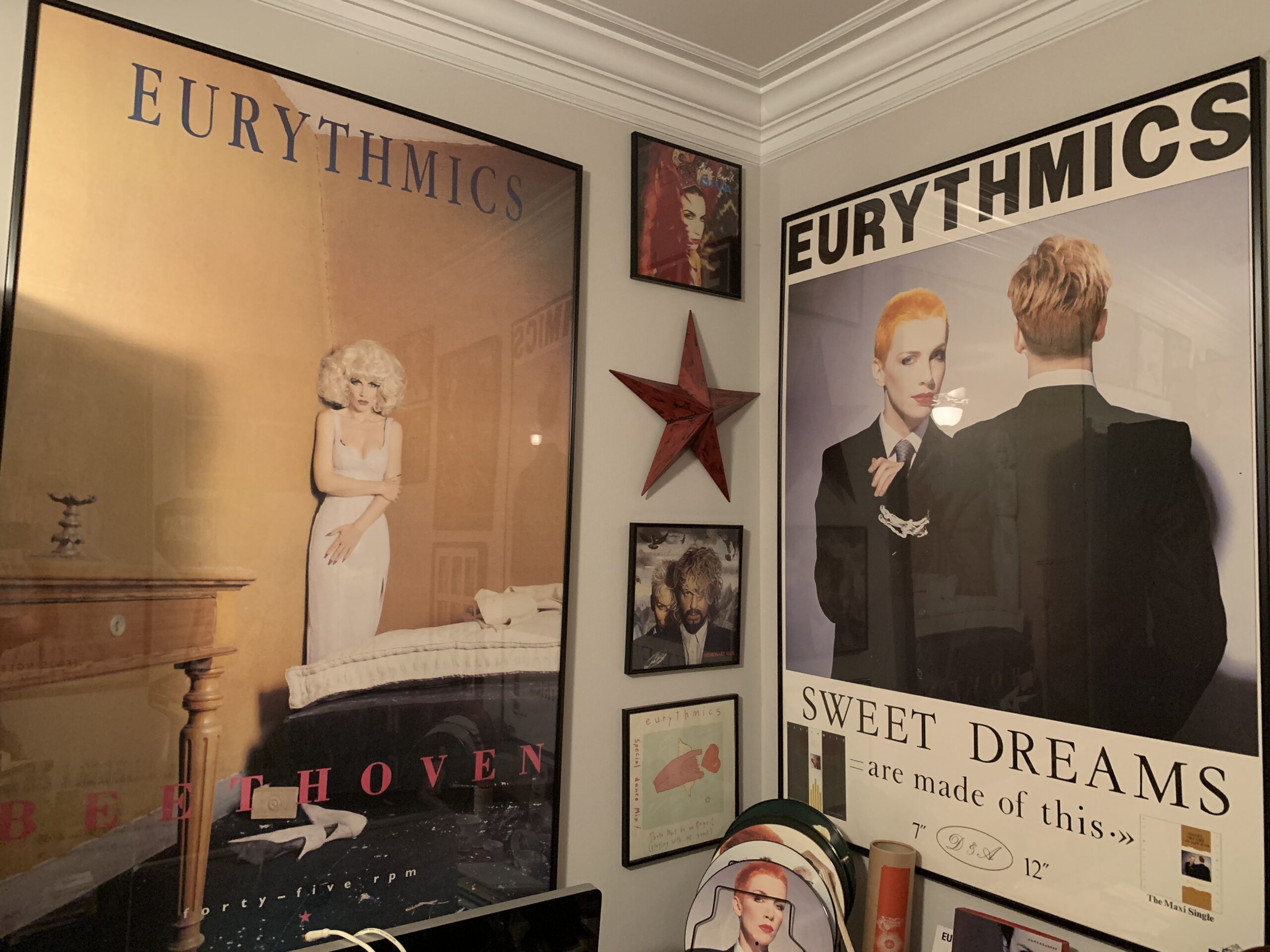
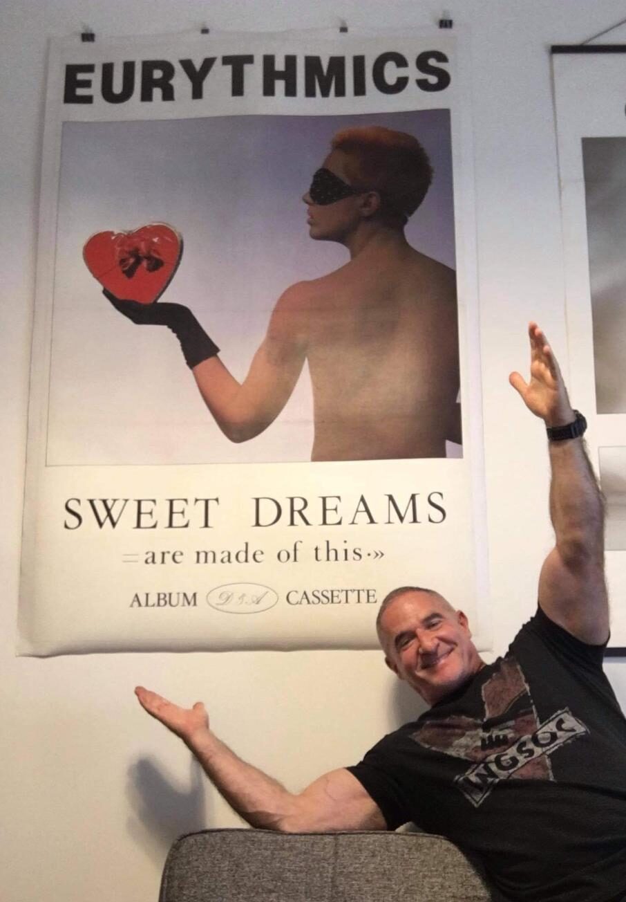
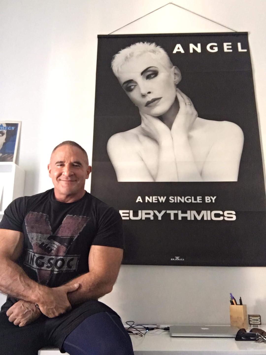
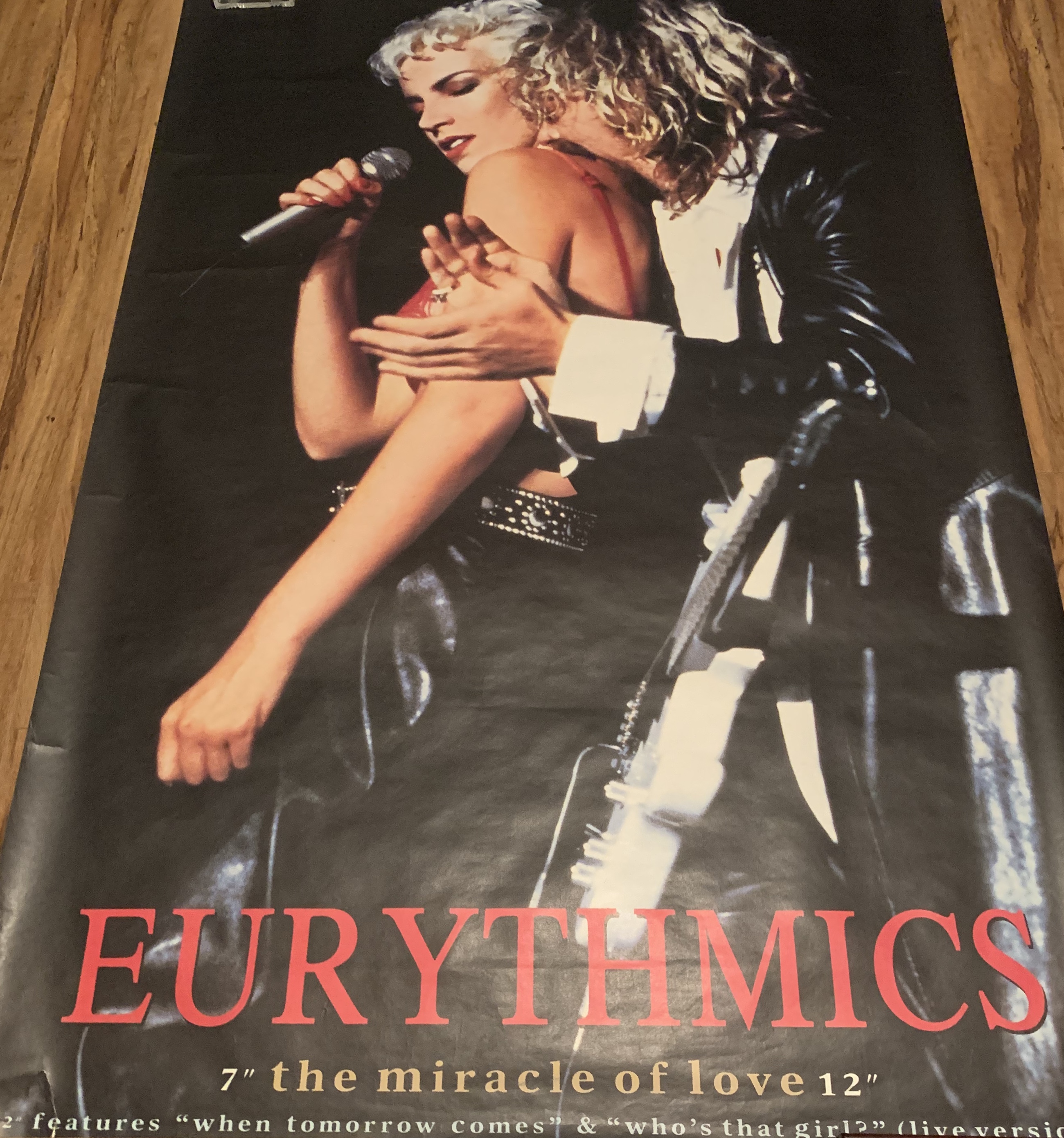
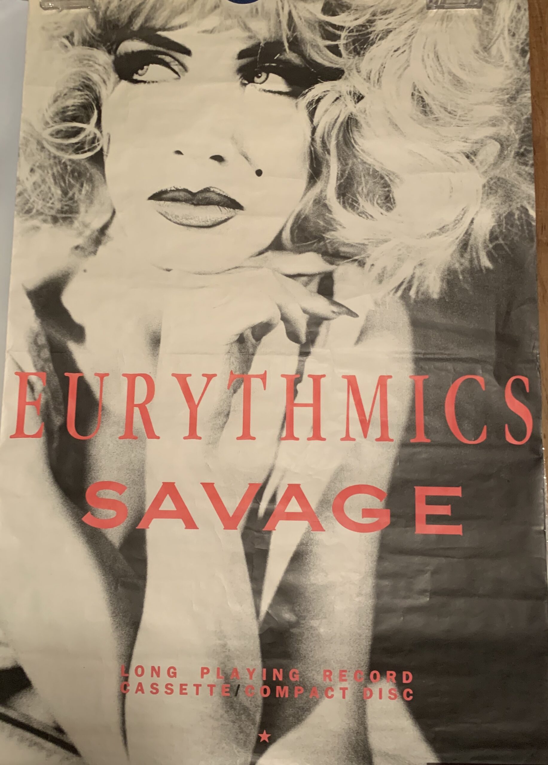
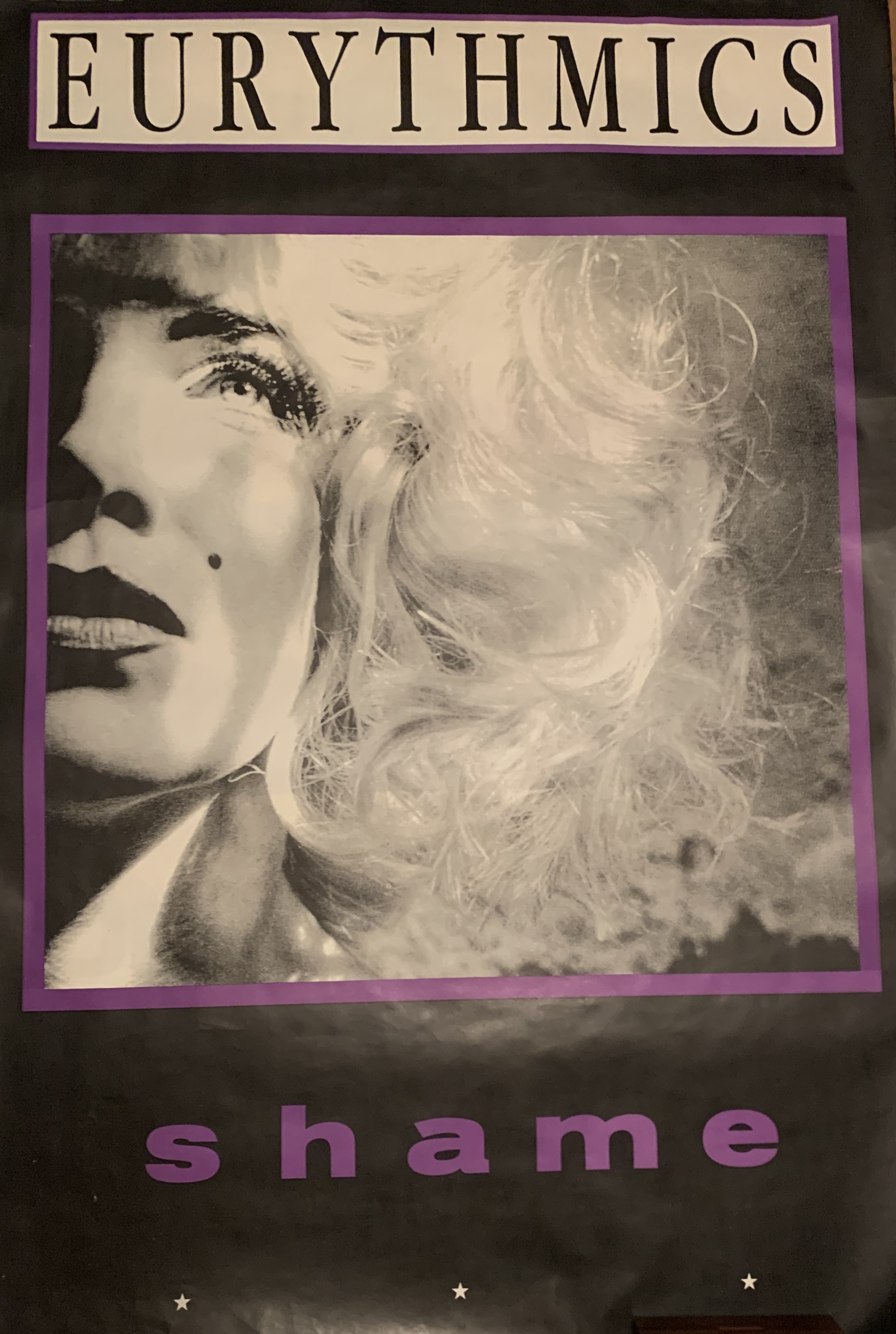
I want to move to something that is very important to me, which are the subway posters (also called fly posters) that you’ve done for Eurythmics. There are a handful of collectors across the world that collect these subway posters. And there are a few of us in Australia, New Zealand, the U.S. and Canada that have a friendly rivalry between us on subway posters. We’ve never been able to talk to anyone about this. So I want to talk to you just a little bit about them. As you can see behind Rex and his beautiful subway poster for the Touch Dance album, we think of them as pieces of art – beautiful iconic pieces of art – and so around this room behind me, you can’t see others — the “Here Comes the Rain Again” subway’s over here, the “Thorn In My Side” here. There’s a “Revenge” poster over here, “Beethoven,” one of the “Sweet Dream” subway posters. I have so many more that are in storage and not in display — they do require a lot of wall space, after all, since they’re routinely around 40-by-60-inches. Huge posters, as you know.
LAURENCE:
OK, but first, tell me how did you acquire these posters?
MARK:
Years ago they would be have been listed in music collector magazines such as Goldmine. Back in the ’80s I was in Tennessee in the middle of, you know, sort of the East of the U.S. as a teenager, and just kind of just becoming aware of music itself through this magazine. And I would try to find things from England or get an import. And eventually these kinds of posters would show up and then later you could go to eBay and from time to time, you’ll see the subway posters. So it’s just that people collected them over the years. Now, the thing is there are subway posters for the “Sweet Dreams [Are Made Of This]” album, “Touch”, “Revenge”, “Savage”, “We Too Are One “and “Peace”. I’ve not seen a lot of posters for “Be Yourself Tonight” or for “1984”. And we’re a little surprised by that sometimes. So my question for you on this is, did you design a subway poster for every album and for every single? Do you recall if it was something that was expected that each album would have its own?
LAURENCE:
Yes, the subway [underground/tube] posters here in the U.K. would be 60” x 40” in size. And why do we call them fly posters? They would be posted up in around the street, kind of illegally in a kind of guerilla-marketing way, but with the understanding that the council allowed you to do that. So they would be posted on building sites, on the backs of buildings, brick walls, wooden hoardings and of course outside the record companies. We still have it today, not as much, but we still have it. And that’s always something I really loved. I really wanted the company to do one for each release, so without me going back into everything, I would say yes to that question that I definitely designed these posters for all of the albums and singles.
That’s something that would be really important. And it was something that was part of the artistic process of getting Eurythmics’ visual designs out onto the street, otherwise you would only be advertising in the music press. And unless you were a music fan, you would never see the imagery or the visuals. What I liked about it was that it would go out in the street, so a man or a woman or a kid coming out of the Tube or going to go to the shops would see this poster and think, “Blimey, what’s that?” And the imagery, as we know, is really striking, so that was an important aspect of it.
MARK:
Yeah, I think you actually have a great photo in the Touch 2005 remastered CD booklet with the “Here Comes the Rain Again” and “Who’s That Girl?” subway posters plastered on a wall of a building.
LAURENCE:
Yes, I did. When the posters would go up, I would go out with my dad’s old Rolleiflex camera from the 1950s, a six-by-four large format camera, and go and photograph all the posters in the streets because I knew they were going to be there for a week and that was it. So a lot of them now have a kind of social historical aspect to them because they’re next to a Spandau Ballet poster or Frankie Goes To Hollywood poster or, you know, an Echo and the Bunnymen poster, so you could see the bands at the time. And, yeah, it’s just has the social history vibe to it and I shot all those. I didn’t as it got more and more successful, as my time became less and less and they were releasing more and more, so I wouldn’t go out and shoot every single poster on the streets, but I have file copies of all I’ve done, including the posters.
We would also do 30” x 20” posters too, which were smaller, half the size that would be used for in-store displays and in-store posters. And then occasionally we would do Tube posters that would go in the subway, as you would call it, on the actual Tube stations. But like film posters, those posters would never meant to be collectible because they would get pasted up, and they’re very cheap to produce. They’d get pasted up and then ripped down or they would be left and the rain would destroy it. And then someone else would come along the following week for their single and paste over our posters. They were never meant to last, you know. But I would go into the record label when I knew that the posters were being printed. I would have checked a proof, and then the posters would come in and those posters would then be sent out by the label to the guerrilla-marketing companies for that weekend to post it around London for the Monday single release.
I would always take two, three, four, five copies of the posters and wrap them up and carry them home on the Tube. And the people at the record comopany used to think I was totally mad. They would think why do you want those copies? We know why you would want a copy of the single, but why would you want the posters? That’s how I ended up with copies of absolutely everything, you know. And sometimes it was a bloody nightmare – the large proofs, and the posters and trying to carry it all and store it and keep it all. Now 35+ years later, I’m really pleased that I’ve kept it. Those posters are a really important part of the archive.
And also with all the albums, and the singles, and everything really that I designed, I kept it all because it was my work, and I felt it was an important part of my profession and my life to retain this work. I always tried to get as much back from the printers and the record companies that I could. A lot of the board artwork, you never got returned. But I kept everything else because I thought it was important – an artist would keep his sketches and Dave and Annie would keep their demos. They don’t throw the demos away if it’s not released, you know, so I’ve kept all my roughs, even the ones that were never signed off or produced or anything, just because it was part of my archive, I didn’t think about the importance of it 35 years down the line. I didn’t think about reissues or re-releases at all. I just kept it because it was mine. You know, it’s only now that the decades have passed, you know, the ’80s, the ’90s, 2000s, 2010s, 2020s. And people are kind of looking at it as art, as you say. And I’m very pleased that you say that because as I was saying earlier, I felt it was art. Because I was a graphic artist and that’s what I am producing. You know, they used to call it, commercial art. You were a commercial artist because you were commissioned to produce artworks.
REX:
You’re an artist, and Dave and Annie are artists, and we’ve heard them say things like 30 years ago they weren’t necessarily thinking about their future legacy. But I think the collectors and the fans have always thought that way. From the very beginning, and from my perspective, we were collecting these things as art that would last for our lifetime. So in the earlier days when we would hear Dave and Annie say things like, “Oh, we’re not looking back”, it was a little bit of a head scratcher for me, because I would think, “Wow, you know, shouldn’t they be thinking about their legacy?,” but I guess that doesn’t happen until later, until years go by.
LAURENCE:
And also when you’re in the zeitgeist of it, you don’t think about that. You’re just moving forward. You’re constantly moving forward. You know, Dave and Annie would be producing an album every 18 months, which was two or three singles, and one or two videos, and a tour. And you’re just doing it. You don’t think about it then. As you said, 30, 40 years later, you look back at it and that is your legacy, you know? And I was very lucky, and very privileged, and hopefully, Dave and Annie would say the same thing – that we stuck together over that period because the body of work has lasted, and it hasn’t dated as it would have if the band had used 10 different album designers and 10 different album photographers. And also in the same way, if they had used 10 different producers for the albums, there wouldn’t be a continuity running through the music and the production that Dave created for each album. The fact that they produced it all has a Eurythmics feel. It’s also got a Eurythmics look to it because I did it all, you know. But that was, again, because it was successful we continued along that journey, which was fantastic. Because if I had designed the cover for “Sweet Dreams [Are Made Of This]” and, obviously, it’s a very important piece of work for me, and it wasn’t a hit, I still wanted to be proud of what I created. The fact that they were hits allowed me to go on to do the next one, and the next one. But if it wasn’t a hit, I was always so involved in it so I felt that it was really important that what was going to be out there – even the single charted at #72 – I wanted the sleeve to still look like a great sleeve forever!
REX:
I think the labels now are understanding the heritage and the legacy thing. It’s interesting how people come around to it, you would think labels would be on top of legacy releases because it makes money for them. And maybe that happens with all bands as they reach a certain point in their career, you know, 30, 40 years down the line.
LAURENCE:
I agree. I think also up until those early 2000s, they were just, you know, signing 10 acts in the hope that 2 acts would really make it big. Then the next year, they sign another 10 or so. So people went out and bought the same album again, and they might have bought it on MiniDisc and Blu-ray. And, you know, it’s just how many times can you get the customer to buy the same thing, but in a different format? And therefore, a lot of the packaging and the rerelease of the catalogues and stuff would just come out, you know, if the artist had died or maybe the odd album that was really important. Maybe it was the 25th anniversary or 30th anniversary, so they release an album again because it was the 11th anniversary, I just couldn’t get my head around it – what’s the point?. But they’re just trying to make some money, I guess, for something. And as I said, if you are asking real fans to spend, all of us to spend a $100 on a package, now people are wanting that package to have some worth and it needs to be brilliantly designed, beautifully printed, have extra tracks on it and stuff. Eurythmics are incredibly lucky that they have a legacy in the 21st century, they actually have a wonderful back catalogue, and rightly so because they are both such talented song-writers, which still sounds amazing today.
There’s a catalogue, you know, Radiohead, Elton John, Bowie, Coldplay, Oasis, Kraftwerk, New Order … you know, all these great artists. But you have to have had continued success for 10 to 15 years to have a legacy and a back catalogue. You know, it’s really hard to have a legacy with maybe a one-hit single, or perhaps one album that did OK, and so the record companies realize that the Elton John’s of this world and all these huge stars, that that’s what they can keep selling as a catalogue, as a back catalogue. You know, speaking to Annie quite recently. … We were discussing the fact that she is now known as a ‘legacy artist’. Which to me, I disagree with, in that I always I feel legacy artists are possibly no longer releasing new things, you know. But she was happy with it, that moniker of saying, “I’m a legacy artist,” because, you know, Joni Mitchell’s a legacy artist and these other artists are too. But I think it’s, maybe it’s just me, but I think it’s slightly derogatory. I mean, you wouldn’t say Picasso’s a legacy painter or Beethoven’s a legacy musician. They are who they are, but I understand it’s back catalogue stuff. So the legacy department deals with the back catalogue, you know, which is what we did with the reissues in 2018 and all the stuff on vinyl, because they’re not new releases. I did actually smile to myself during the Eurythmics vinyl back catalogue re-issue project that we did recently. As I previously said about me collecting fly posters, and the in-store displays and all that printed stuff. I would go into the record label and say, “I’ll keep that proof, and I’ll have my artwork back please, and can I take that because I have the original, and I’ll keep the cromalin (color proof), and they would give it to me. Sometimes they were just going to bin it anyway, imagine that! They just didn’t understand why I would want it all. Could you bike the proofs over to me? Can I have four copies of the tour program? Please make sure that I receive the printed running sheets of that cover …. And they used to just laugh at me. You know, now I’ve got everything. They now ring up and say, “Do you have that tour program? Do you have that original proof?” Ha yeah, of course I do. You know, as I said it was just my work so I wanted to keep as much of it as I could, the record companies didn’t care at all, once they had used the artwork for a particular release they were onto the next one, why would they want to keep it, they really had [or have] no respect for any of the design or photography that was created, they just don’t care really, so the thought of my artwork going in the bin just really upset me. I most certainly didn’t keep everything I’ve ever created for any band or artist over the past 35+ years thinking that at some point further down the line it would be needed, that wasn’t it at all. I’ve managed to build up a huge archive of all of my design work, and I’ve kept the work that I created for the non-releases, dropped artists, failed albums as well as for all of the successful releases as well. I kind of ended up being the creative archivist for the Eurythmics without really thinking about it really. That wasn’t really my intention. It’s just because I designed everything and kept everything. So I’ve been the kind of warehouse keeper for everything designed and printed for Eurythmics. I’ve got the complete visual history and the creative identity of the bands’ 35-plus years of amazing worldwide success safely stored and archived in my attic, home studio, storage warehouses [x2], archive storage box companies, in my main design studio, in plan chests, in archive boxes, in various portfolios … just everywhere.
And I feel now as I was saying to you earlier, Rex, that if a fan or a museum or a gallery had asked me 20 years ago for something, I might have just said no. But now, I’m starting to collate all of the design + artworks properly and realize that actually the work has got some importance and maybe visually it should be allowed to go out there. You know what I mean? It’s got a life of its own now because it’s lasted this length of time.
MARK:
There’s always an excitement when someone comes across something no one has seen. And very recently someone on eBay bought the “Love Is a Stranger” subway poster. I wasn’t aware of anyone who had ever seen it before that time.
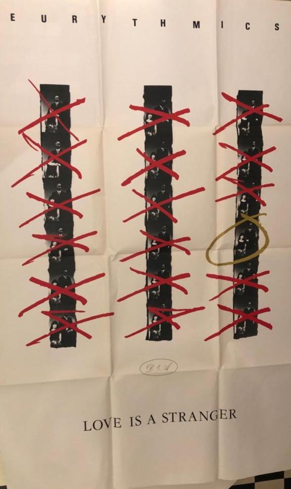
LAURENCE:
Oh, yeah, I saw that. That was the very first fly poster I ever designed. The idea was that I had a contact sheet of Eurythmics from the photo shoot, and I remember seeing a contact sheet that Marilyn Monroe had ‘attacked’ with a hairpin scratching out all of the images that she didn’t want to be printed. I really, really liked how that looked. So what I did, was to do the opposite. I decided to circle one image on the contact sheet, not sure if people realized why I had done this, but the image on the “Love Is A Stranger” contact-sheet fly poster, that is circled in gold pen, is the image that appears in full on the front cover of the actual single sleeve. Also that was a ‘teaser’ poster design, put up the week before the single was released, and then on the week of release the main fly poster went up featuring the main color image featured much larger on the poster.
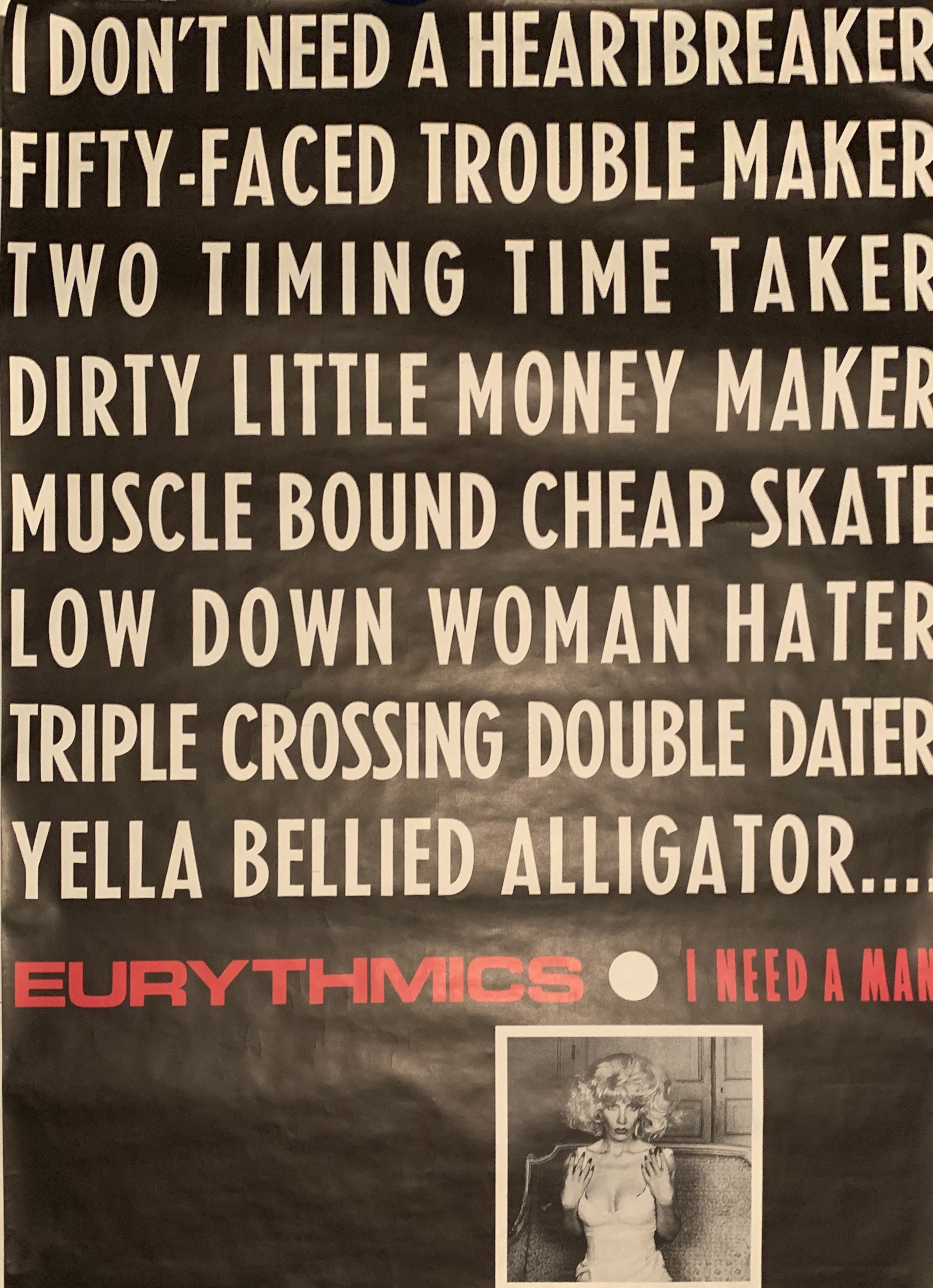
But yes, that was my first 60” x 40” fly poster design. As I said, it’s definitely one of my favorite formats of designing a campaign for an artist. I was amazed to see that someone had sold that fly poster for $100, which I thought was fantastic value. I don’t know how they had it to sell. I don’t know where they would have got it from originally. Pieces of Eurythmics artworks turn up all over the place, maybe someone’s brother worked in the record company or the marketing department, maybe they took a poster down that they liked, or kept a couple back before they sent them out to the fly postering company … that kind of thing. And now their children are discovering these posters and selling it all. They say, “Oh, I’ll put it in a frame, it’s retro, it’ll look cool”. So yes I was very surprised to see that because I thought that I was the only person in the world to have the original “Love Is A Stranger” flyposter, it just goes to show, you never can tell what you’ll find on eBay!
MARK:
So, wait, so you’re saying there’s a “Love Is a Stranger” subway poster that’s similar to the “Sweet Dreams” with the big photo?
LAURENCE:
Yes, there is.
REX:
You’re going to be tracking that one down huh, Mark?
MARK:
A Christmas gift once from my wife was the “Sweet Dreams” poster with the candy heart and the “Right By Your Side” poster.
LAURENCE:
How did she get hold of them?
MARK:
A collector in Australia who was selling parts of his collection. I’ll tell you real quickly, the first poster I bought was when I was a teenager was from a record store and the manager knew that I really liked Eurythmics.
And he said, “Hey, I got in a new catalogue where we can order things and there’s a poster called ‘Eurythmics looking at a divine light.’ That’s how it was worded. And I said, yeah, and I was a teenager, so it couldn’t have been more than 10 bucks. Ten dollars or something. Yes. And so the next week it came in and I went in and he said, “Come here to the back, you’ve got to see this.” And he laid it out on the floor. And it’s the “Here Comes the Rain Again” subway poster. I’d never even seen such a huge poster. It was amazing. That single is my favorite song. Again, I go back to your logo so that for a 15 or 16 year old that was a mind-sort-of-blown kind of moment (to see that huge poster).
LAURENCE:
It’s fascinating, because, I mean, I was only 23, so I wasn’t really that much older than you at the time that I designed the “Here Comes the Rain Again” poster, as well as the “Touch” album sleeve. And that was why I said to you previously, I created the logo and the “Here Comes the Rain Again” title design – every song title on the album had its own type design. So therefore, you know, typographically it looked great. But it also linked it to Eurythmics, because no one else had done that, and it became that even their graphics had been thought about. That’s what I wanted to put across, and without those Letraset sheets, I couldn’t have done that.
I’m sitting in my parent’s house at the dining room table rubbing it all down on the board artwork. You know, that becomes something that nearly 40 years later still looks good. I’ve still got most of the original individual title designs that I created laboriously with my Letraset sheets.
But when we re-released the vinyl albums again in 2018, I had to recreate all of the designs again digitally, because up to 1994 everything that I had designed was created manually by hand. Everything was analog, in fact nothing existed digitally or on any of my hard-drives until I worked on the ‘Boxed’ CD album release in 2005. So I basically had to recreate all of the 12-inch LP design + artworks from scratch!
MARK:
You had to redo all that?
LAURENCE:
Yes, completely. I had to redo everything, so I had to work out what font I’d used, what typeface I’d used, worked out the spacing, the sizing, the kerning … I must say that it was slightly odd recreating artworks exactly as I’d done 35 years ago. But I felt it was regenerative because I was having to not just reproduce it for the sake of it, I was actually recreating some aspects of it, of the design you know, reviewing it again, looking at it again and making it kind of new, as it were, on the new artwork.
MARK:
Well, that was no small feat.
LAURENCE:
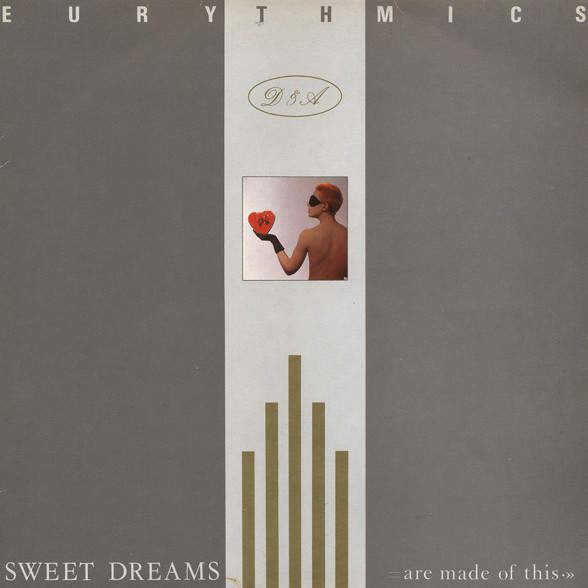
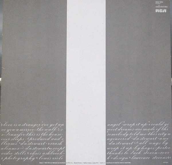
Yeah, well tell the record company that! They just thought it was nothing. Recreating the exact artworks again for those 8 x wonderful classic albums, was just over a year’s work. And I would say the “Sweet Dreams [Are Made Of This]” album, and the “Touch” album easily took me a month to do just on their own, because that original “Sweet Dreams [Are Made Of This]” album typography on the back cover, which has got all the credits and the track listing, was dry transfer Palace Script typeface. There’s lots of little dots and arrows and other little graphic aspects to the text setting. And then when I redid it two years ago, I had to redo it digitally and match exactly the spacing, the slight weird indents and all that kind of stuff, you know. It was really quite involved. You know, I was thinking, “Shit, why did I do this in ’83? Why did I not just set it all in Helvetica? It would have been a hell of a lot easier!”
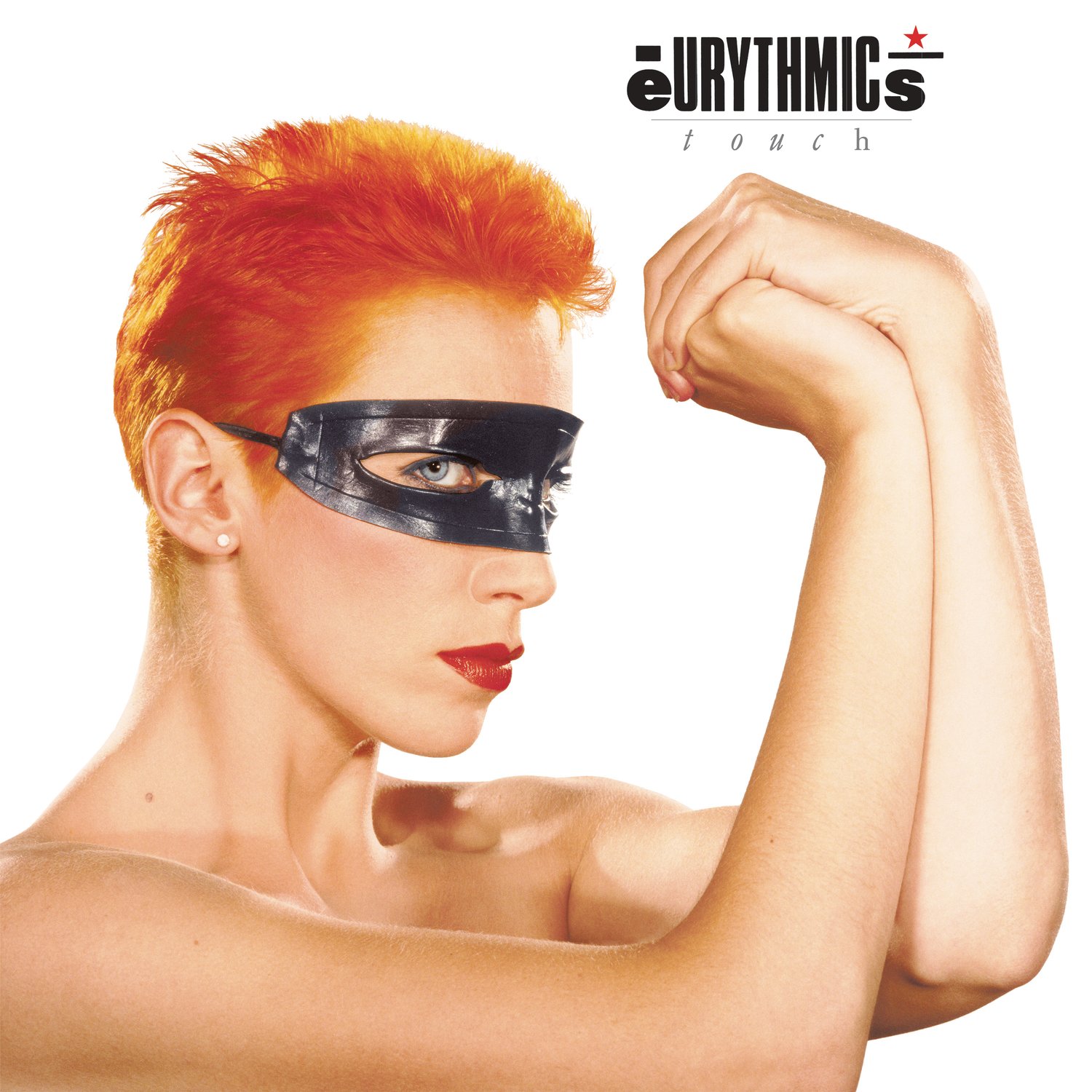
So, yes, it was it was quite a feat. It’s interesting you should say that. But definitely I hadn’t really thought about it. But with “Touch,” that was definitely a turning point, I think, design wise, graphically and musically for the band, and suddenly the band’s logo had a life of its own and therefore I could then use it on other formats further down the line. To me, it was always just as important as the music. I don’t mean that as a big thing to say at all, but, whether it was for Eurythmics, Morrissey or Muse or even Annie Lennox, whoever else I designed for, it is really important to have a sleeve or a graphic identity that will last – as we know people’s favourite albums lie around in their record collections forever!
MARK:
The last three words on the back of the “Sweet Dreams [Are Made Of This]” album are “Design Laurence Stevens”. I think that is so cool.
LAURENCE:
Ha! Thank you. It was just a nice typographic way of ending the paragraph I guess, and my credit fitted really well at the end, after a bit of juggling of the letters that is. I think it was just fortuitous the way it kind of worked out with the success of “Sweet Dreams [Are Made Of This]”. Imagine if the very first song you ever wrote was “Satisfaction” or, you know, “Heroes” or “Careless Whisper,” so for me and it was bit like that because “Sweet Dreams [Are Made Of This]” became a ‘hit’ album cover for me and it was the first album cover I ever designed. And it was just huge worldwide, obviously. You know, it still is. And it is an odd thing. I don’t think about it until we have these discussions or someone says, “You know, we’re doing this thing on album covers. Could you just say something or send us an image?” It’s just so much part of my life. And obviously, Dave and Annie’s life, too; it’s not something I think about daily. But I’m incredibly proud of the work and really fortunate to have met Dave and Annie when I did, we both met each other at the right time I guess …
MARK:
I’ve written stories for 30 years. And sometimes someone will say to me, “Remember when you wrote that story or remember when you interviewed me that time?” Often, I have to say, hmmm, vaguely or sometimes I do. But it’s sort of ‘This is the job’ and you’re doing this and life’s moving along.
LAURENCE:
That’s exactly right, Mark. And that’s what Rex said earlier, I agree with him, you don’t realize you’re building a catalogue of importance or a legacy, as it were, until it’s 20, 30, 40 years down the line and the band is no longer releasing anything. So you have time to take stock and to look at it all. You know, it was only in the last couple of years that I realised I need to collate all of this work properly. You know, obviously it’s all archived, but now it’s going to be officially numbered, so that each individual piece of design, test print, photo, original rough, visual etc … will have its own individual archive No. And I will, finally in 2021, be on Instagram @lsd_studio_london so I can put up unseen images and roughs and the logos you were talking about and all that kind of stuff, because I’m finally sensing that people would like to see that, you know, it has a life of its own rather than being just linked to the album sleeve and to the music.
That’s why to me, with the fly posters I was very lucky at the time to design, because, again, the band was successful, and they would just let me kind of do what I wanted to do. I really didn’t realize that there was any other way of being creative. Obviously, as you work with other artists, you realize it’s not like that, but those fly posters, and the in-store displays, and the record sleeves and stuff, they just let me do whatever I wanted to do creatively, I was given a lot of freedom which is a complete dream as a designer. And some of those things, I would never even show Dave and Annie. They would perhaps see the fly poster on the street because I wasn’t able to show them. When it got so big, they sometimes just weren’t around. I couldn’t email them or anything. I couldn’t send them a PDF. I would talk to them on the phone or I’d go and see them with my designs if they were recording, I might go over there and show them – here’s an idea for a fly poster, and they’d say, “Yeah, that’s great. That’s great.” You know, so stuff like a press ad, no one ever saw those designs until they appeared in the magazines, not even the label. I just did it. I would just send the final press ads for the single or album release directly to the publications, and they would get printed, you know, the band or management never really saw the marketing formats that I created. I’m certain that there are loads of promotional items, posters, promo formats, press release materials etc … that I designed that Dave and Annie never ever got to see.
MARK:
Another quick kind of story, as I’ve been collecting these kind of things for a very long time, no one had seen the “Who’s That Girl” fly poster. And then suddenly there was one. Oh, my God, someone folded it up. And of course, that just horrifies a lot of us.
LAURENCE:
That goes back to what I was saying earlier, all my posters and large flat proofs are rolled and obviously kept flat, because I’m a ‘pain-in-the-arse graphic designer’ and I don’t like things that are folded unless it’s part of the design. So as I said, all those years ago I’m having to take the rolled up fly posters on the Tube, and then on the bus when I was living miles away from ‘The Church’ thinking, what am I doing? But I felt it was really important to keep it all flat as it’d been designed. That’s why I didn’t approve of the “Savage” poster that was in the album being folded. I felt at the time that you couldn’t really do that to one of Alastair Thain’s fantastic photographs of Annie. A poster that has fold creases on it doesn’t look good mounted in a frame. But if we did something that had to be folded, I used to sit and think, how can we not do that. Can we put it in a tube? So if you bought the album, you would be given the poster in a tube but the label just said it was impossible at that time to get record shops to do that. You know, now direct to customer D2C, you can do that – you could order it online. And if it was a limited edition box set or something, you could send them a poster in a tube. It wouldn’t have to be folded, you know?
MARK:
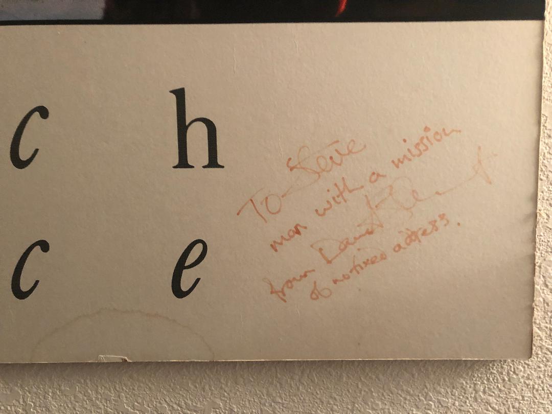
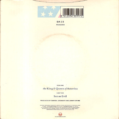
Well, let me let me change direction. This is when we get to collectible moments. There is a “King and Queen of America” 7-inch with a picture sleeve that fans refer to as the “Presidential Sleeve,” which has stills from when Dave and Annie are in the video dressed as the U.S. president and first lady. I’m coming to the horse’s mouth here. Was that a withdrawn sleeve that got into stores and then they pulled it back? Is that accurate? Did you have anything to do with a design for a “King and Queen of America” sleeve that featured only the presidential images?
LAURENCE:
That really relates to what we were discussing and saying earlier as that sleeve was put together in the U.S., in the States, by the record label over there – I didn’t design that sleeve. I do remember that I mocked-up a sleeve design at the time for the single which featured a series of stills from the video, rather like a collage, which then featured the Eurythmics logo and title wrapped around the American eagle. I even did a much better version actually come to think of it, with a full-bleed image of Dave and Annie but dressed as Marilyn Monroe & Elvis from the video, using the correct typeface and logo that I used on the “We Too Are One” album cover – I think that that sleeve version ended up being the Brazil version or a Mexican promo sleeve, something crazy like that! But my designs really looked nothing like what eventually ended up on the cover. Actually I thought that that track was never officially released as a single in the U.S.? Of course I may be wrong there, it was 3rd single off of the “We Too Are One” album if my memory is correct, so it’s an awful long time ago …
MARK:
OK, got it. I’ve got these pictures.
LAURENCE:
I didn’t design that version of the sleeve. I’ve obviously seen the ‘presidential’ sleeve that you are referring too, with the images of Dave and Annie and the panels of stars and stripes, but I didn’t design that sleeve. At least they used my original design elements to create the U.S. single sleeve. Are you saying that version has been withdrawn and that’s not the official single?
MARK:
Oh, no, no. That was as far as anyone knows, never an official single. From what people say, it’s always been believed to have been a withdrawn single, most likely from the UK.
LAURENCE:
OK, well that’s the first thing that I’m not able to help you with, sorry. Funnily enough a lot of fans weren’t too keen on that single, I think they felt that it had all gone a bit ‘rock’ you know. With “Revenge” and even with “We Too Are One”, Dave and Annie had written these two albums that were very kind of stadium rock albums. They seemed a million miles away from “Love Is a Stranger,” but they weren’t for me because obviously as with the fans, we were part of the progression of it. But a lot of that period, they were in America more than they were even in the UK. You know, they were touring in America, as well. So the label took it upon themselves to come up with that “King and Queen of America” sleeve – even all the images and the video shoot were all done in the States. I wasn’t there when they did that.
MARK:
But you designed the official single in the U.K. for “King and Queen of America.”
LAURENCE:
Yes, I did. But, again, my designs or visuals would go over to the States and they would use the bits they wanted to use and change it. I think also some territories preferred to have their own version – this is the U.S. edition, this is the Polish single, and this is the German single and stuff, so some of it worked because they kept to the original design, but others it just looked dreadful. I showed Dave and Annie some of that stuff and they’ve never even seen it. They didn’t know anything about it. I’d see something and I’d go to a meeting with them and I would be a bit kind of pissed-off about something. And they’d say, “Well, what are you going on about?” And I’d say, “Well, look, the record company has just done this,” and they’d say, “Don’t worry about it.” But that kind of thing really annoyed me when the different record companies would do that. You know, if Paul McCartney sent me a track, I would never cut the end of it off and put a saxophone solo on it. Why would they do that with the artwork that I’m delivering to them? You know, sometimes things would just be out of control and you couldn’t keep control of it all because it would just drive you crazy. It’s funny talking about that specific single sleeve now, as it was just starting to be the ‘beginning of the end’ for the band I guess, it had all got so huge, especially in the States, and by that time around 1989 some things just slipped through it was really impossible to keep control of it all, and I really tried my best.
MARK:
Of course!
LAURENCE:
Regarding the fly posters that you’ve managed to collect, Mark, would you have bought them from a record store or would someone have got it for you from the record company?
MARK:
Well, it was all back in the day. You go through these magazines. The only one I got locally in a record store was that “Here Comes the Rain Again.” Others would have bought in the ’80s and not for a great deal of money at all (back in the day) from second-hand record stores and collectible companies.
LAURENCE:
What I’m trying to explain about the fly posters is, as I said, that they were delivered to the record label or to the marketing company. They would be posted around town and that was it. It was known that if you didn’t take one off the wall, you never got one. So how did you have people that had them, particularly in America? Because when we were working on whatever the next single release was going to be, I would say “I’d like to do a fly poster campaign”. And they would say, “Oh, no, we don’t do it for every act.” I’m talking about other territories and specifically the U.S. A lot of the times they wouldn’t do subway posters.
MARK:
Well back in the ’80s, there were probably a handful of import record stores, ‘Record Runner’ in New York City. There were some good ones in San Francisco and L.A. But like I said, I have a lot of them that I bought back in the day. As far as I know, all of the subways I have are from England — I just got them as “imports.”
LAURENCE:
The fact is that officially I’m a graphic artist, so I always rather liked the ‘artistic’ side of being a graphic designer because it was what I created. I create non-commissioned visuals, which was working with type and creating collages, and digital paintings. So, you know, I was physically an artist I guess, as well as, being a graphic artist in the ‘commercial world’. And a lot of the posters that I had created were obviously for a commercial stand of just selling that single, that 7-inch or 12-inch and cassette. As I went on, I was more aware of the posters as being artistic pieces, and I was trying to be even more minimal with how they looked. I was trying to take off the track info and other details. If you look at the “Sweet Dreams [Are Made Of This]” poster for example, the record label would always want me to include a ‘pack-shot’ of the album or single on the poster, and I eventually would remove those off of the design because it just looked messy and it also became too commercial for the band. For that, as I felt for the band, Eurythmics were a very artistic band, particularly with some of the ideas that Dave had, his surrealist ideas.
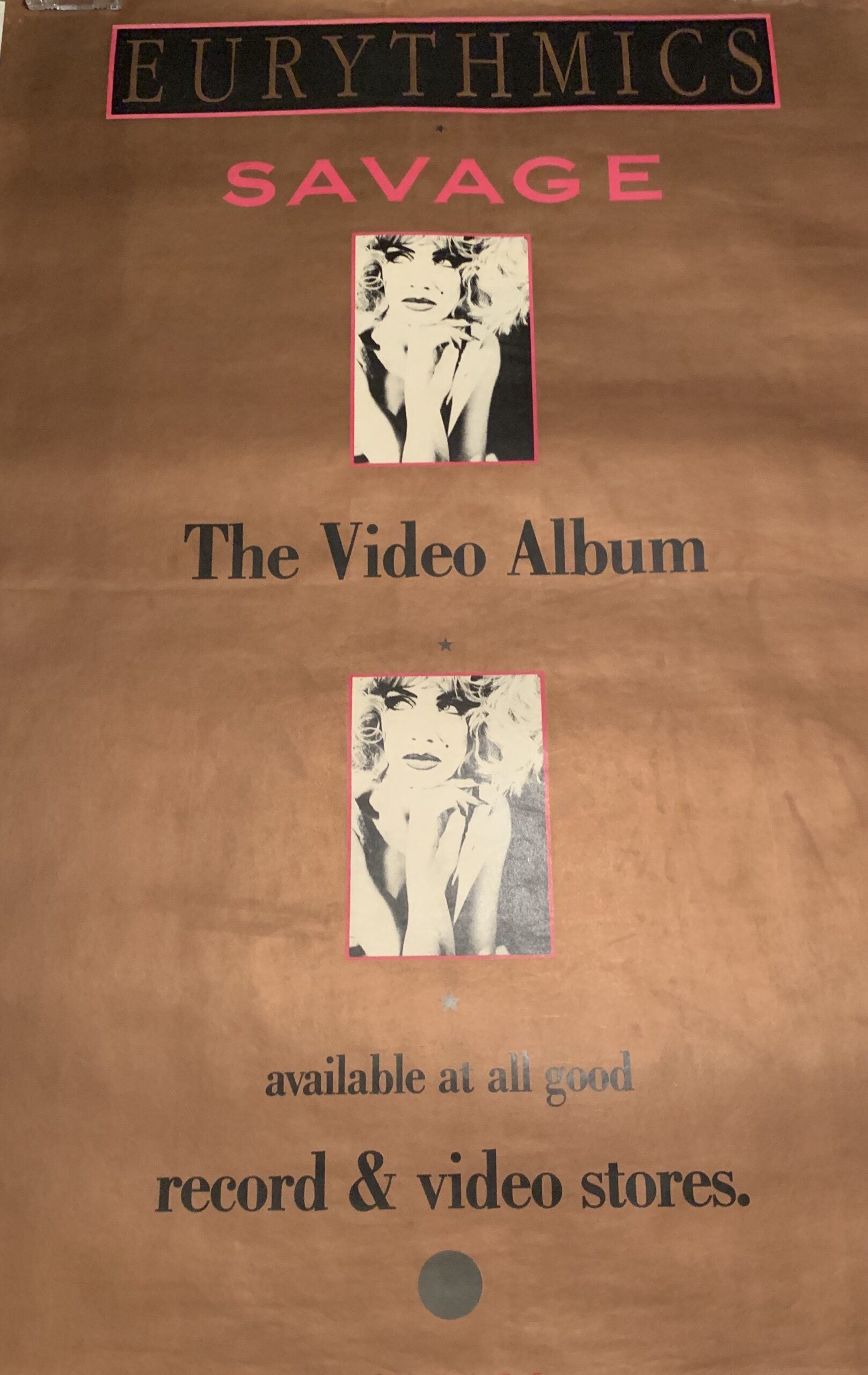
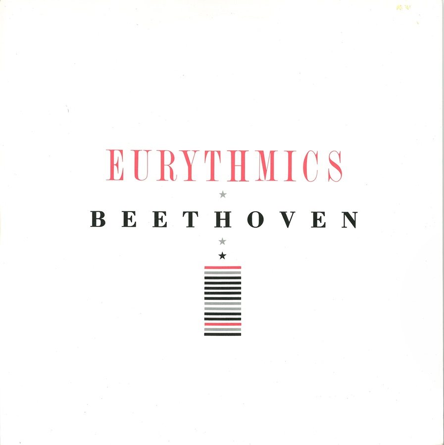
But if you look at the “Savage” posters and the “I Love To Listen To Beethoven” posters, there’s very little on there apart from the name of the band and the title. And that was hopefully creating artwork that someone who wasn’t a Eurythmics fan, or even knew what it was, maybe would have it as a poster in their corridor or in their flat, you know – just because they liked the typography and the great imagery.
MARK:
Someone posted recently that they had the “Savage” album subway poster and just had it framed and they have at the end of their dining room, actually. And we had a discussion about it. It’s a stunning piece of art and the photography, how you did the subway poster, the size of it. I mean, so that’s a big part of it.
LAURENCE:
It’s so weird to hear this. You know, I do appreciate it. It’s great. And it’s great to talk about design, as well as the music. It’s really fantastic. You don’t really think about that at the time when you’re ‘in the thick of it’ as it were. So to design something like that poster for example, when the record label says that they’ve brought the release date forward, and that it’s Friday afternoon, and they need the fly poster designed and completed by Monday… you know, so you’re getting an image trying to work it out. You can’t show Dave and Annie as they are away touring, and you’re thinking, shit, I’ve got to get this right. You send it off. They print it. They paste it up around town, and then next week you’re on to the next project. So to say someone’s framed it, or they really love it, it’s fantastic to hear.
You know, that’s like you saying to Dave and Annie, I love the B Side of “The Miracle of Love”. Maybe it was a track that they didn’t think was strong enough to put on the album, but it’s still a piece of their creative song writing, their work, so it means something. It’s just that you’re creating work and it is really nice when you get some feedback, you know, because often you don’t. Without sounding too ‘pretentious’, as I started to become successful through my work with Dave and Annie, I became a designer working with other bands who would approach me and commission me to design their record sleeves. I did feel even then that the sleeves I designed and created were pieces of art, and that hopefully, they were going to have some legacy. I did feel that those album covers would be on people’s bedroom floors for 10 years, and it had to look as good at the time it was released, as it would look 10 years down the line. Obviously certain things have aged, photography-wise and styling-wise, but with a lot of the established fonts that I used with Eurythmics, it’s kind of kept it looking classic. You know, something that I designed way back in 1982 doesn’t necessarily look like a 1982 sleeve, if you understand what I’m trying to say? And even with some of my other record sleeves, notably with the “Diva” and “Medusa” album sleeve designs that I created for Annie’s solo releases, they have both lasted the test of time as well, which I’m very proud of, and feel vindicated for those sleeves to still look as strong today as they did when I originally designed them.
REX:
You know, Laurence, a lot of times you’ll use a font that I haven’t seen before, and then later I’ll start seeing other designers using it.
LAURENCE:
It’s interesting you say that, maybe it’s just in the ‘design ether’ I guess. I mean, typography in some instances to me can be more important than the actual photography on the sleeve. And believe me, a piece of bad typography can definitely kill even a great photograph. On a number of Eurythmics promo releases I wouldn’t use a picture at all. I would only use typography. For example, the 12” promo sleeve that I designed for “Savage”, it just says “Eurythmics Savage” in black + pantone ink, dayglo pink. There’s no image on it at all. I just use a lot of vertical and horizontal bars, graphic idents to relate to the title. So a lot of the promo stuff that we did and maybe some of the press ads, there was no image at all. The typefaces that I would research and then use were just really a typographic tool to add some intrigue to the Eurythmics style, you are right I did like finding typefaces and certain fonts that hadn’t been used in rock ‘n roll before. I would say that it’s a lot harder to do that today, as then, as designers we were quite privileged because you could build a campaign. Firstly with a fly poster, then a press ad, promo cd, promo 12” single, then release the 1st single. And then you release the second single, and then finally you would release the album. So you had time to build the campaign and establish the overall feel and style of the images and band graphics. But now, it’s all really singles – artists release singles all the time, one after the other, then maybe an album, then they release another series of singles, all looking totally different.
So I did see the whole process as a product. So you built a full marketing campaign. Even now, I go into a record company and we’re talking about a brand-new act. And I would say, “first single, maybe second single would look like this, and then I would do the third single like this”. And they say to me “Hey wait a minute, let’s just see if we can get the first single away” … but I like to build the releases as a proper campaign, to give it some gravitas, some meaning, some importance, rather than just release singles to test the water, but unfortunately sometimes it’s not possible to work like that.
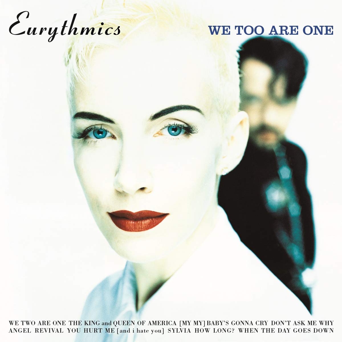
MARK:
Well, let me ask you quickly about that. The “We Too Are One” album, which I found very fascinating all these years with the names of the songs on the bottom on the cover. And I’ve always wondered, was the idea to make people wonder what’s different, what’s-the-back kind of thing, or was it just let’s try this? I’ve never seen it done before, so there had to be a reason.
LAURENCE:
It’s really fascinating because a lot of the stuff I did for Dave and Annie, I wouldn’t even have the time to show them. Obviously, we would agree on the image, or if possible I would produce some initial visuals to present to them, but often it was just me ‘on my own with my design thoughts’. Actually, at one time Annie and I lived quite close to one another in North London, so I would just take the design visuals and ideas around to show her. What about this? How about this, you know, and then she would say, “Ok, that’s great, you know, the title is going to be this.” So I would just go ahead and do it. It’s funny because you are asking me questions about certain aspect of my design work that Dave and Annie never even asked me. So the idea of placing the track titles on the front of the “We Too Are One” cover was just something I decided to do at the time, because it just looked right and again was a different approach. Also it meant that by having Dave’s image on the reverse of the sleeve, I could repeat the type pattern at the bottom featuring the song titles to give the impression that the sleeve had two front covers.
Sometimes on certain things I did kind of wonder why Dave and Annie never asked me about a particular design, or why I created the type like that. You know, I was with Dave a lot last year, because he was over here in the UK working on the ‘Eurythmics Songbook’ live shows and we were going through a lot of back catalogue stuff, and picking images to have on the live projection screens that Dave wanted to have for the shows. And he would look at something and say, “Why did you do that on that sleeve design, or why did we put the title there, or why does that look like that, and how come you put this on the back?” And you know, it is quite interesting for me that they are asking these questions now.
But going back to your original question concerning the positioning of the song titles on the “We Too Are One” cover, as I said I liked the idea of having the titles on the front, because, again, no one had done it as far as I knew at that point, and it also created a nice line underneath the two images, it also meant that I didn’t have to place any type onto Jean Baptiste-Mondino’s fabulous photographs.
Also it meant that the front and the back of the album sleeve had the same importance that normally the front cover would only have, it was just as important that Dave was on the back and Annie was on the front, or it could be the other way around, you know? It was to balance it all out really. And when I did that, the record company, and especially the sleeve printers, thought that they had misunderstood the artwork and printed it upside down. But that was completely intentional on my part, that was just a graphic kind of twist. It was just something that I was playing with, and as I said, I was very lucky to be able to do those type of things. Nobody said, “you can’t do that”. So I really had the creative freedom to come up with, and to execute the design ideas that I wanted to put across. Also, Dave and Annie [hopefully] completely trusted me I guess, of course if they didn’t like something it wouldn’t appear, I would never design something just for the sake of it. Obviously, because I had created the Eurythmics design template from the very start, I could then play with it and move it around as I knew what to do creatively to make it all work for their next release.
MARK:
That’s why we think you are just as iconic to Eurythmics, because there was a lot of thought to this. It wasn’t just a quick we have another single coming out, throw a picture up/whatever and go on and move on. So we immensely appreciate you being with us today about all this stuff.
LAURENCE:
No problem at all, it’s really nice to talk to you guys about the design process. Because I know that Eurythmics have sold something like 100 million records! And I’m speaking to two fans today, that obviously appreciate the music. I didn’t think fans took it that seriously. As I said, I always hoped that people would take both the music and design together seriously, you know to me they go ‘hand in hand’, so that’s fantastic to be told that. As I said earlier, I worked really hard on every aspect of the band’s designs — absolutely everything. I wanted it to look right, and sometimes you know, I spent way too long on worrying about things that I shouldn’t have really worried about; the positioning of a barcode, the size of the catalogue number, the size of the legal lines, the placement of the titles on the paper vinyl labels… everything you know. People would say to me, especially at the record company, “Who the hell’s going to notice these things?” But I do, and it’s part of me, I couldn’t do it any other way.
So it’s nice that you’ve picked up on things, and definitely makes me feel that it was worthwhile doing and worrying about all those years ago. I would have done it anyway. But I did spend a lot of time on the positioning of things and the size of it. I mean, you were saying about how I would send artwork off to different territories and they would just increase the logo and such. They would increase a Eurythmics logo because they felt it was too small, or they wanted to make the title bigger, but what they didn’t realise, or care about, was that by doing that it threw all of the positioning of the imagery and type completely off balance. But because it was a hit, people at the label would say to me, “don’t worry about it, no-one knows …” And I would think, ‘Oh, for God’s sake, you know, it doesn’t look the way it should look,’ so yes all that stuff is important to me, and I do appreciate your comments.
It’s all out there you know, in the world, all those marvelous fantastic Eurythmics songs, all those single + album sleeve designs, all that hard work that people get to see and hear forever. You know being a ‘record sleeve designer’ is a strange part of the graphic design process really, because you design a record sleeve and if it’s really successful, the whole world gets to see it. It is not as though you have just designed a specialist book cover that only a couple of 100 people are going to see, or you’ve created a design for a piece of packaging for something that only a small part of the population will ever really see. You know, millions and millions of people get to see a successful record sleeve design, even if they’re not even a fan of that specific band or artist you know. So, I’m very precious and grateful about it all, because it’s my life and I feel it’s incredibly important. So to get that feedback from you, means a lot to me to hear that you and your fellow Eurythmics fans thought that my designs for the band were just as important as the music, it’s great to know that, and I was extremely fortunate to work with two artists that were just wonderful and allowed me to do it. And I kind of understood them both, as much as one can. I think that I understood what they were about, you know? So it meant that when they weren’t in the UK and I wasn’t able to go and see them, that due to the trust that we built up, they knew that I was going to do something that was going to be acceptable. You know, I knew what they liked, what they didn’t like, the colours that we could use and all those kind of technical things that you just do so subconsciously just by working with someone for 5, 10, 15, 20, 30 years.
You know, I must say, working on all those Eurythmics album releases, designing all those campaigns was really fantastic. It was all just really great. Working with both Dave and Annie is just wonderful, they are both such talented artists and it was a real pleasure to have been part of it all in some way. Even when Dave first played me “Love Is A Stranger” and “Sweet Dreams [Are Made Of This]” on a small cassette recorder in his flat, I just knew that they were going to be huge, the tracks sounded amazing, and then when Annie died her cropped hair red, that was just genius … I knew that they were on their way…. And, you know, as I said at the start of this interview we were very lucky to have met each other in that RCA Records office all that time ago in September 1982. Maybe, if “Sweet Dreams [Are Made Of This]” wasn’t the huge worldwide hit, and the band were then dropped from the label, and they then split up and worked with other people, who knows what would have happened? You’d certainly be talking to someone else today that’s for sure.
And actually, since working together on the reissues of all the 12” vinyl albums with Dave and Annie, I’m now having to deal with people at the record company that were maybe age five and six when Eurythmics released those albums … it’s mad. There’s no one at RCA Records now that I originally worked with during that whole successful 1980s period, they’ve all gone, they’ve retired or they’ve just left. And talking to the people at the label now who are the point of contacts for the Eurythmics catalogue releases, it’s very strange because they ask me, “I can’t believe that you designed this sleeve, wow that’s so great …” and you can see the cogs turning inside their head and they’re thinking, bloody hell, this is all quite important!
You know, if you keep something, you keep it because it’s important. You don’t keep rubbish. So as I keep saying, I’ve kept it all because I felt it was really important. And now I’d like to think that people understand the importance of it all. It took us over 35 years to get to this point, where hopefully all those designs are more than just a record sleeve, you know what I mean?
I remember that in the early ’90s, stores like IKEA and Habitat sold picture frames that were 12-inch squares. They were four in a row allowing you to drop in album covers from the top of the frames, and I distinctly remember thinking, “Ah, you know, finally album covers as ART!” Even if you don’t like ‘The Clash’ music, the album cover looks really cool. You’d see people in their flats with the record covers in those frames on their walls and I’m thinking, ‘yes, that’s exactly what I’ve been going on about for ages’. You know, now that we are approaching 2021 it makes me think, that going to art college, doing a graphic design degree, trying to explain to my design tutors “that I want to design album covers”… They just thought I was made, to them it wasn’t proper graphic design, it was just throwaway. Why would you want to do that? You know, it’s pop. It’s here for a week and then no one takes any notice of it. And that’s why I tried to make it as important as it could be, because I really believed in it, sometimes even more so than some of the bands or artists that I had the privilege to work with actually.
But the importance of the album cover to me, is that if you re-released “Abbey Road” or “Aladdin Sane” or “London’s Calling” or even shall I say “Sweet Dreams [Are Made Of This]”, you would never, ever, ever change that album cover 10 years, 20 years, 30, 40, 50 years down the line. But, if you bought a copy of George Orwell’s “1984” book in the ’80s and ’90s or even today, the cover will always change. They update it. They change it all the time. But you would never do that to an album sleeve. That, to me, really shows that the album cover has some artistic value in the world, just shows how important it is – so hopefully it hasn’t all been for nothing!!! Let’s see where we are with music design in 2055. I still think that “Sweet Dreams [Are Made Of This]” will definitely be being played and listened to, and hopefully, the grey album cover with the small picture of Annie holding an empty box of chocolates, will still look good in people’s record collections!
We would like to give a huge thanks to Laurence Stevens for sitting down with us for over two hours to give the longest interview of his career. A massive thank you from all of the fans as well to Laurence for giving such an in-depth analysis of his work with Eurythmics, Annie Lennox, and Dave Stewart. Laurence is genuinely touched to know that so many fans hold his work with Eurythmics in such high regard and consider it an integral part of the whole visual element of the band. It would not have been the same without you all these years, Laurence! Please visit LSD STUDIO’s Instragram page here to follow Laurence and see all of the interesting work with Eurythmics, and many, many others artists.