Interviews
U N D E R C O V E R
Examining Eurythmics Art & Design with Laurence Stevens – Part 3
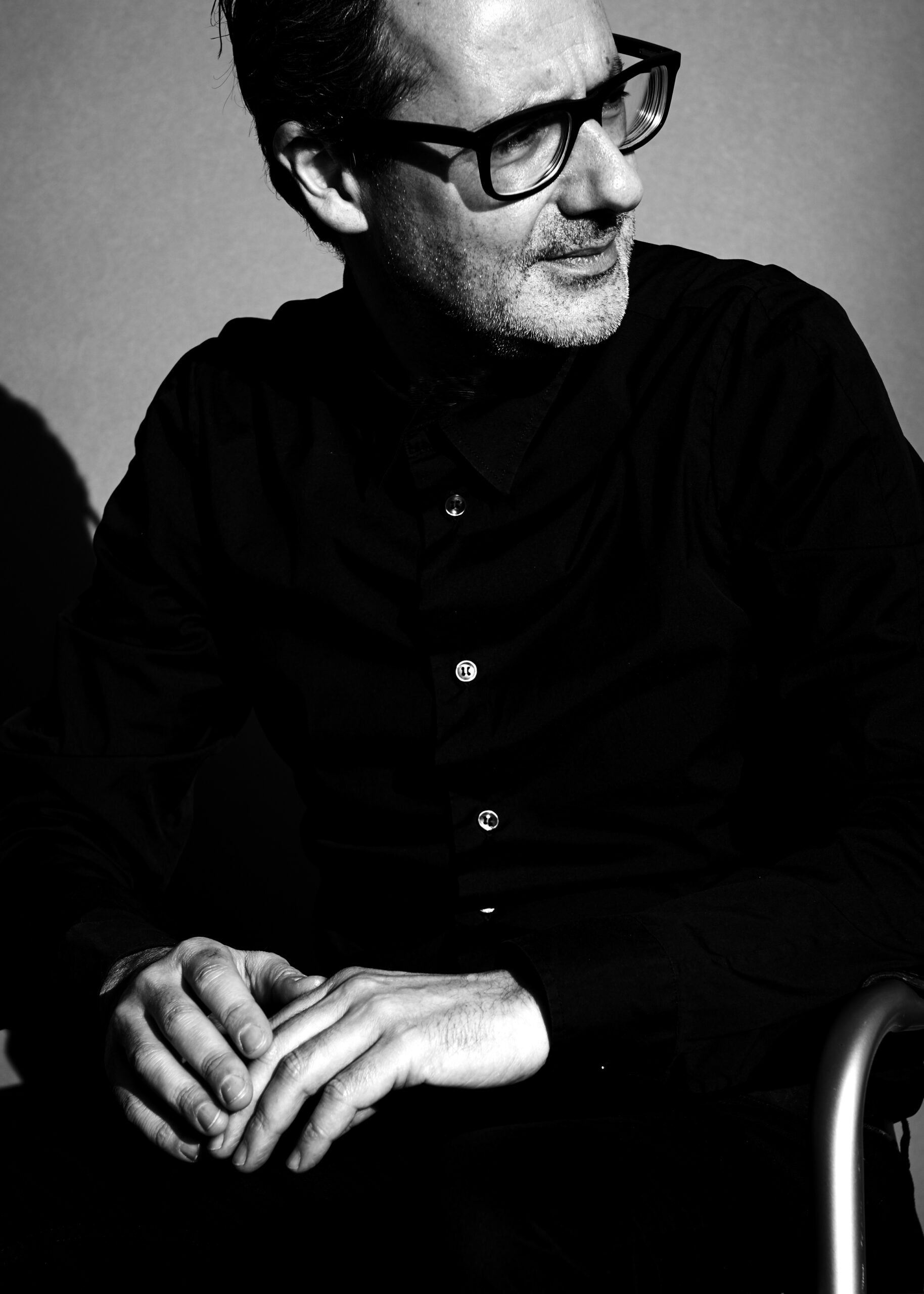
May 15, 2021 – Part three of an exclusive interview conducted by Mark A. Stevens of MAS Communications LLC and Rex Saldaña, Eurythmics Video Visionaries webmaster, over Zoom between the USA & London, England, on Wednesday, 25th November 2020, with Laurence Stevens.
Laurence is Eurythmics’ Graphic Designer & Creative Director, a unique partnership and collaboration that has spanned 40 years, something unique in the music industry.
In Part 1 of this interview, Laurence discusses his love for graphic design and how he started in the record sleeve design business, and how he came to work (by chance) with Eurythmics and the creation of the designs for the initial singles “Sweet Dreams (Are Made of This)” and “Love Is A Stranger”.
Part 2 focused on the design concepts for the “Touch” and “1984 (For the Love of Big Brother)” albums and singles.
Here, in part 3, Laurence discusses the albums “Be Yourself Tonight”, “Revenge” and “Savage” and the design concepts he created for those projects.
MARK:
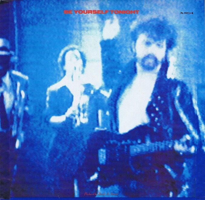
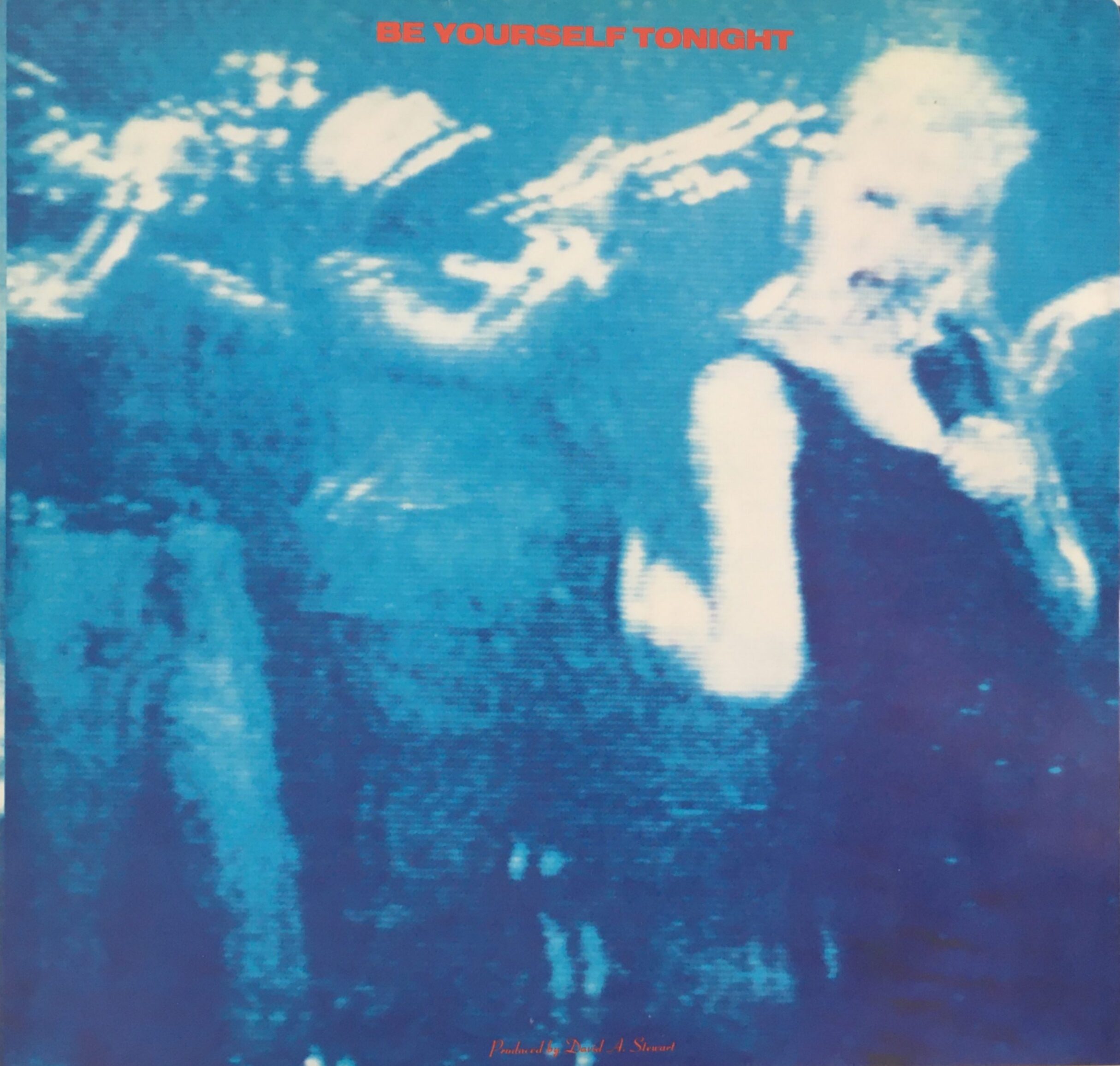
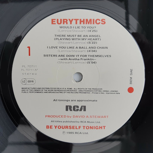
So now let’s talk about Be Yourself Tonight. The singles deviated a little from your more precise designs for previous albums. Each design of the four singles is drastically different in concept. Why was that? And can you walk us through the four singles?
LAURENCE:
Well the ‘difference’ in the design of those single sleeves that you refer to Mark, as well as the actual “Be Yourself Tonight” album sleeve, was really due to the situation that the band found themselves in during late autumn 1984 – spring 1985. Mainly due to the fact that Eurythmics had become so successful – they’d ‘cracked America,’ as they say – that unfortunately, for me, they weren’t in London as much as they used to be. So any opportunity that I had to present designs or artworks to them, or for us to discuss creative ideas together became pretty limited.
The “Be Yourself Tonight” album was mostly recorded in Paris, where both Dave and Annie were living at the time. That wasn’t too bad as I could fly over to present ideas to them while they were recording in the studio that they had set up in the outskirts of Paris. You must remember that this was before ‘Eurostar’ [which is the train that you can now take directly from Kings X Station in London through to Paris in 2 hours, 30 minutes] so it was a bit of a number to have to keep flying over to see them, and we couldn’t send creative ideas to each other using email of PDF … as none of that existed. We didn’t even have mobile phones then, so I couldn’t call them whenever I wanted to. So whenever we had an opportunity to meet up, while they were recording that album, I really had to make sure that I had all my creative questions worked out and had my initial ideas prepared and ready to show them, as they only really had limited time to see me then and to discuss any design ideas.
As I said previously, at the start, it was really just myself and Dave and Annie talking through the various design ideas and creative aspects for the various releases, and I had lots of time to present different ‘design roughs’ to them. However, within approximately three years really, that had all changed.
There were just so many more people involved now that the band had become so successful, and everyone wanted a piece of their time. … I do remember that during this crazy period, that I would often be waiting in a studio or backstage area by myself, just waiting to hopefully have the opportunity to show them some new artwork. I would also often be getting on a plane to visit them either in the U.S. or somewhere in Europe, carrying my large A1 board design visuals, and a bunch of new logo ideas and photocopies all rolled up ready to present to the band as soon as I landed. I’d never put my portfolio or design folders in the hold on the plane as I was always worried about them getting lost or not getting through customs, so I always physically carried everything, which you can imagine drove the air stewards on the plane mad.
In fact, I distinctly remember Dave calling me once quite early in the morning, and suggesting that I come over to the studio in Paris that day to have a design meeting with him and Annie as they had a few hours off as they were going to do some interviews. So I got everything together that I wanted to show them, got to Heathrow and flew to Paris I think at around 11 a.m. I arrived in Paris, the record company arranged for a car to take me to the studio. I met with Annie and Dave, we had a pretty quick meeting, discussed what we needed to. I then left a couple of hours later with a list of changes and various notes, got driven back to Charles de Gaulle airport and flew back to London. I think that I arrived back in the studio at around 9 that evening, not even having the time to even eat or have a cup of coffee while I was in Paris – oh the glamour of being a record sleeve designer!
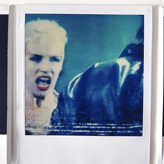
Obviously, for all of the other album releases, there had always been a photo-shoot that we specifically did to accompany the main album image and respective single sleeve ideas, but as I said, during this period it was extremely hard to tie the band down in order to do a photo-shoot, they were just so busy. … So it was decided that the best way to get around this would be to do the photo-shoot for the “Be Yourself Tonight” album in the USA while they were finishing off recording some of the tracks, and also making the video for the first single release, which, as you know, was to be “Would I Lie To You?”. So myself and the photographer Peter Ashworth flew out to Los Angeles to specifically get the album cover shot and the single sleeve images, we stayed there for nearly 5 weeks – but unfortunately, Peter didn’t manage to get the album cover shot – it’s a long story which I won’t go into here, so we’ll have to leave that for another time. But, luckily, what we did get from one of the shoots that we did with Annie, during this very eventful trip, were the cover images for the “Would I Lie To You?“ single sleeve. Peter had hired an old photo-studio in LA for the day just to get some images/press shots of Annie, we were just experimenting I guess to see what we could come up with. We took a lot of quite stark portraits of Annie, just in black and white mostly using the natural light in the studio, with no stylist or even a make-up artist.
MARK:
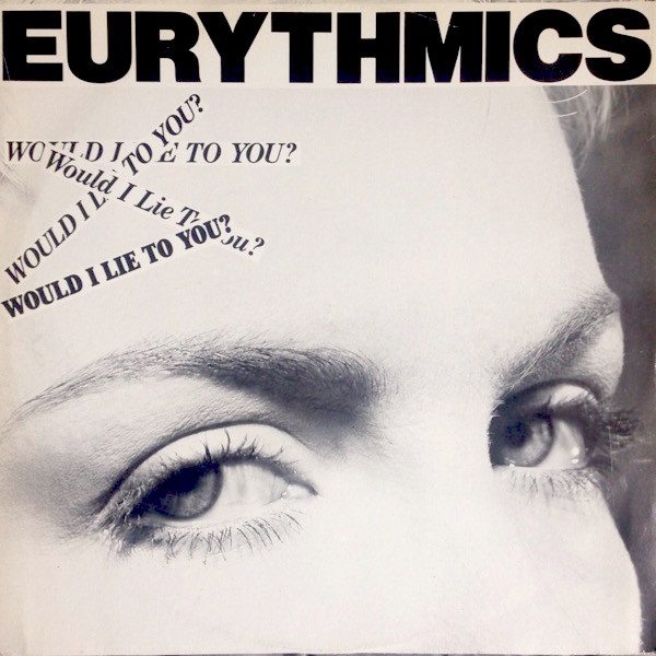
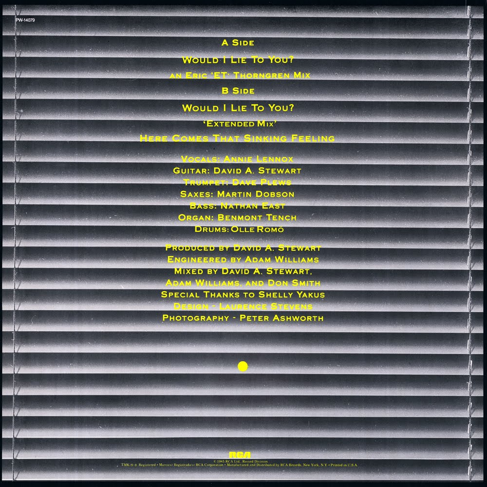
I always thought the “Would I Lie to You?” sleeve had an almost detective look to it. I loved the blinds on the back of the sleeve.
LAURENCE:
Funnily enough, Mark, your comment about that sleeve ‘having a detective look to it …’ isn’t far off, so well spotted! When I went through the large format contact sheets back at my hotel room, to me they had the feeling of the old ‘police mug shots’ about them, and when I cropped into them tightly, to make Annie seem as though she was looking straight at you, to me the image just fitted the “Would I Lie To You?” song title perfectly. The venetian blind image that I used for the background pic on the reverse of the sleeve was just a random shot that Peter had taken just as a lighting test I think, but again it seemed to fit the whole vibe once I began to work with the images and create a kind of concept for the single sleeve. The idea of placing the ‘strips of titles’ on top of one another on the front cover, positioned over the tight cropped image of Annie’s eyes, was really just a graphic reference to a kind of ‘ransom note or torn newspaper message’ feeling. I guess I was just going with the criminal/detective feel of the way that the sleeve looked.
So really, concerning the sleeve designs for the other singles released off of the “Be Yourself Tonight” album that you are asking about, thinking about it now, I just continued on the same creative path that I’d started with for the “Would I Lie To You?“ sleeve design, basically I was just using and working with what I had at the time, trying to make the sleeve designs fit the song titles and to make them as interesting and as relevant as possible.
Again talking to you about this now, after all this time, and thinking about it, during this period I was on my own as Dave and Annie were just not around as much, so creatively I was putting the sleeve designs together and creating the marketing campaigns by myself. For a designer this sounds great, and sometimes it is, but when you’re working with such a huge act and the singles that they are releasing are so good, it can be a bit of a responsibility and pretty stressful at times.
So, yes, you are right, the four singles that were released off of that great album all had a completely different look and feel to them, because they were designed around the actual song title[s] rather than me working from a series of selected images taken from a photo shoot of Dave and Annie.
MARK:
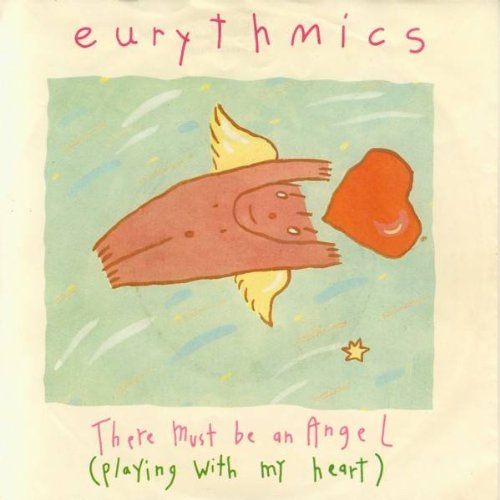
The sleeve for “There Must Be An Angel (Playing With My Heart)” had a lot of whimsy about it.
LAURENCE:
In relation to the sleeve design for “There Must Be An Angel (Playing With My Heart)”, I totally agree. This isn’t really recognizable of the type of design/graphics/artwork that I would normally create. All I can say is that I was given the Lindsey Loch illustration and told that Annie liked this picture, so would I use it for the single sleeve.
I created the child-like hand drawn lettering to make it match and to flow with the look and feel of the pastel-colored drawing. Obviously none of us knew at the time that the single was going to be so successful and become the bands’ first UK No.1 – if only we’d known!
MARK:
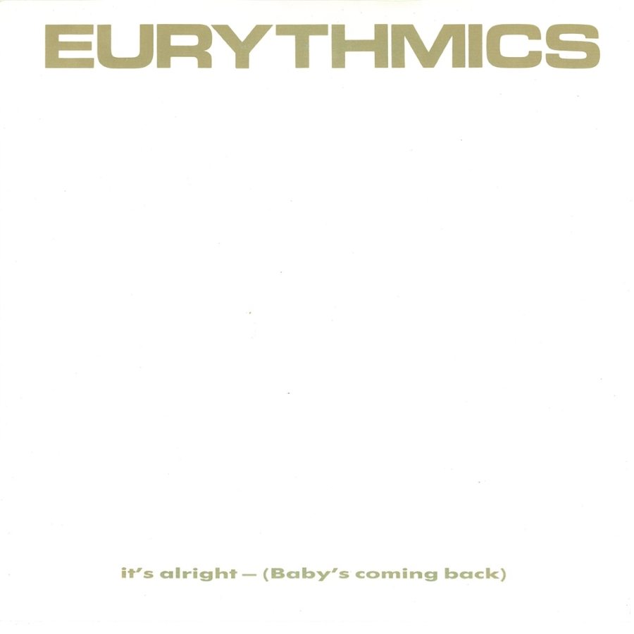
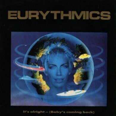
What was with the original white sleeve for “It’s Alright (Baby’s Coming Back)”, and why did it get a new single sleeve with that beautiful shot from the video?
LAURENCE:
I guess maybe that was me trying to get back on track with my minimalist graphic approach. I created the promotional sleeve design for that single [which is sent out to DJs and radio promoters], just as a typographic sleeve, using PMS ‘gold’ on a white gloss background, with ‘gold’ type credit on the reverse. I’m not quite sure what happened, but the commercial single was released using that ‘typographic’ sleeve design, and then when the band made the animated video for the track, I re-designed the sleeve featuring a still of Annie taken from the video. So both sleeves were released … maybe one version was going to be for the 7-inch and one was used for the 12-inch sleeve, I’m not 100% sure.
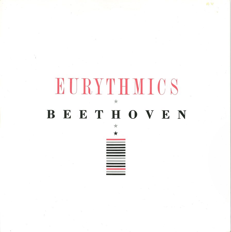
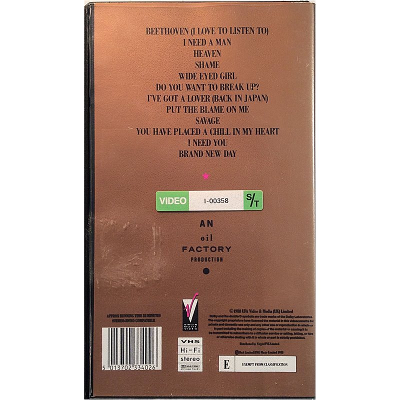
At the time, I was ‘allowed’ to create quite graphic promotional sleeve designs by the record company, as the fans and audience were never meant to see these sleeves. I’m not sure if you’re aware of this, but I also designed a very minimal typographic promo sleeve for “Beethoven [I Love To Listen To]” which is in fact one of my favourite pieces of record sleeve design that I ever created for the band.
MARK:
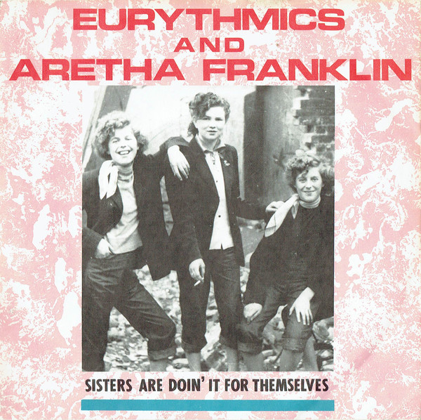
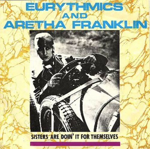
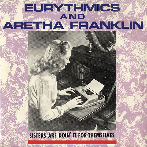
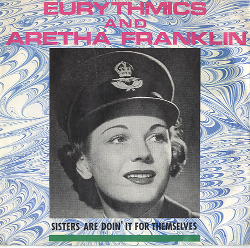
Yes! I am aware of that “Beethoven” promotional sleeve. It is a nice design! Totally different than the commercial sleeve, of course, but interesting, especially from a typography perspective. But, quickly, let me finish off the “Be Yourself Tonight” singles. “Sisters Are Doin’ It For Themselves” had four different sleeves in the U.K.
LAURENCE:
That’s quite an interesting story, actually. What a fantastic song by the way. … It’s funny, because when you’re working on these projects at the time, you don’t have any idea at all of how successful the songs will become along with the sleeve designs you are creating. And “Sisters Are Doin’ It For Themselves” is one of the greatest songs of the 20th century. I remember being with Dave and Annie in Los Angeles when they were told that Aretha Franklin had agreed to sing on the track. They were just so excited about that.
Sometimes, as a graphic designer, there are times when the creative brief requires you to have to problem solve, and this was one of those times. Obviously, as Aretha Franklin was featured on the track, and was a huge worldwide star, her name definitely had to appear on the front of the single sleeve. But this was an official Eurythmics single, so I needed to make sure that Aretha’s name didn’t appear larger than Eurythmics on the sleeve. I had to find a way around this problem and to also make the sleeve design work for both artists. You’re having to deal with two management companies at the time who are obviously looking out for their respective artists, along with their record companies, so as I said it can be quite demanding.
Usually, I would start my initial designs with a photograph of Annie and Dave, but this would obviously look wrong with Aretha’s name on the sleeve, and they hadn’t done a photo shoot with Aretha, so no images existed with the three of them together at the time. … Anyway, in my mind, a photo of the three of them on the front of a single sleeve just wouldn’t have looked right, so I was quite pleased that I didn’t have to work with this type of idea. So it was a bit of a tough one.
While I was a graphic design student at LCP [London College of Printing], I used to create and make collages in my sketchbooks, using old black-and-white photographs that I tore out of the magazines and the various second-hand photography books that I used to buy.
So I felt that this just might be a creative way around the problem that I had, of designing a single sleeve for this great track — i.e., having a strong image and giving both artists ‘equal billing’ as it were.
I showed some of my collages to Annie and explained the idea, which luckily she agreed with. We then discussed the idea of selecting images of ‘woman working’, which again as I explained concerning the other singles from this period, would work to illustrate the song title.
To cut a long story short, I created a few collages using found black-and-white imagery from the 1940s of ‘working women’ and images of ‘women doing mens’ work’ … I then mixed these with different typographic titles featuring both artists’ names. They looked great, but didn’t have the power [visually] of some of the other sleeves that I’d designed for the singles off of the ‘BYT’ album. So I had the idea of pairing the images back and of just using one big bold image, of just one woman for the cover. Annie really liked this idea, and I remember taking my old 1940s photo books and magazines round to show her and we went through them together, to find a great image of a ‘working woman’ to use on the sleeve. We selected quite a few different images to choose from, but neither of us could decide on which image worked the best, and also just having one image on the cover to sum up the word ‘sisters’ didn’t seem right.
So I had the idea of doing multiple covers, a series of sleeves using the images that we had selected. I think we had picked out seven images in total to use. Normally, if I had suggested to the record company that I wanted to do different sleeves for a release, they would have said “no”. But because Eurythmics were having such great success at that time, when I suggested this idea to the label, they agreed. Sometimes it helps to work with successful bands to get your ideas printed and produced I guess! Maybe Annie had a quiet word with them, too. … I like to think that anyway. They finally agreed that we could have four different single sleeves, which was great. The four different b+w images that we ended up with were also chosen for how they looked on the 7-inch square format, you know how they cropped, and how they looked and worked together as a set. As the photographs were ‘vintage’ and so old, and taken from random publications that had to be over 50 years old to use for copyright purposes, I never found out or knew who the actual original photographers were, so I wasn’t able to credit them on the individual sleeves.
But years later, in the late 2000s, I was at a photographic auction at Sotheby’s here in London, and there in a frame on the wall was the picture from the Sisters ‘pink sleeve’ of the ‘teddy girls on a bomb site’, it looked so great. I was so pleased to see it as a proper photographic print, as I’d only had an old magazine version of that image to work with. Only then did I discover that it had originally been taken by the famous British film director Ken Russell, and that the picture was officially titled ‘Bombsite Boudiccas’. What a great title … it totally fits with the song completely. I’m sure Annie would have loved to have known that at the time – as they say ‘some things are just meant to be’!
MARK:
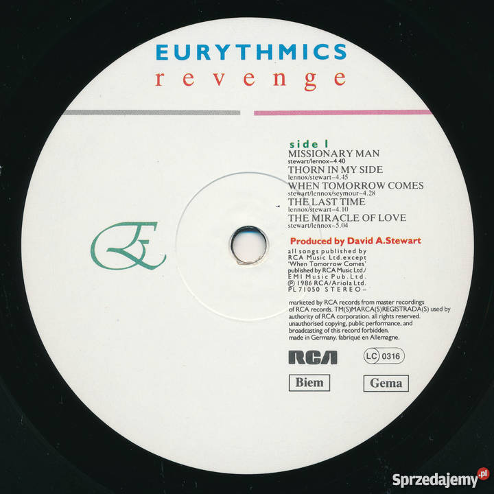
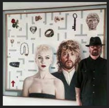
Can you talk a little about Revenge and the concept of the game board and even the various “pieces” — the clock, the snake, the heart, etc.
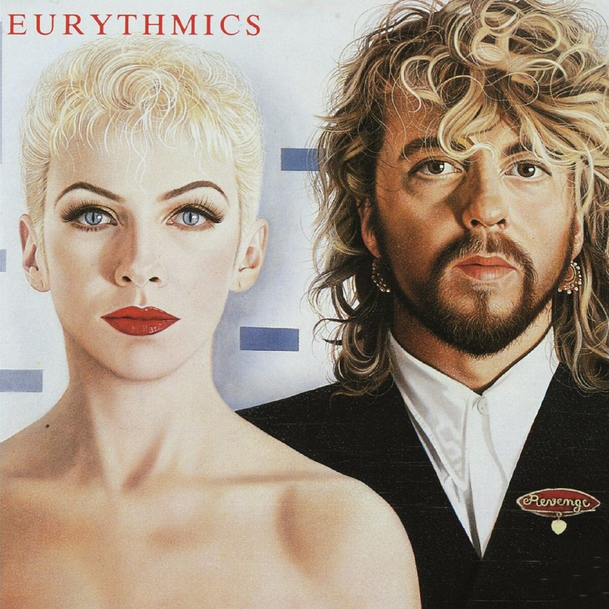
LAURENCE:
That’s interesting to hear that you refer to the “Revenge” design and imagery as a ‘board game concept’, Mark, as that was never the intention at all. It was Dave’s idea to get his longtime friend, Eric Scott, to create a painting for the album cover. Eric was a very established and well renowned artist in his own right and Dave had known him since their Sunderland days.
I remember at the time, around 1986, that Dave and Annie were both living in Paris and Eric had actually set up his canvas and easel in Dave’s flat and was working on the painting daily. It was really amazing to see it all come together. It was just one large painting with all of the elements that you refer to placed around the main stunning portrait of Dave and Annie. I might be wrong here, but I do seem to remember that Eric might have also created small individual paintings of some of the other elements too like the clock, snake, rose etc … He also painted the separate painting of Dave and Annie together that we used on the cover of the “Missionary Man” single sleeve. The main visual idea was to move away from having a photo of Annie on the front of the album sleeve, and to incorporate the two of them using a different creative process. Once Eric had completed the painting, it was then decided that we would use elements of the painting to illustrate the single sleeves, and the painting would form the main part of the “Revenge” album campaign imagery.
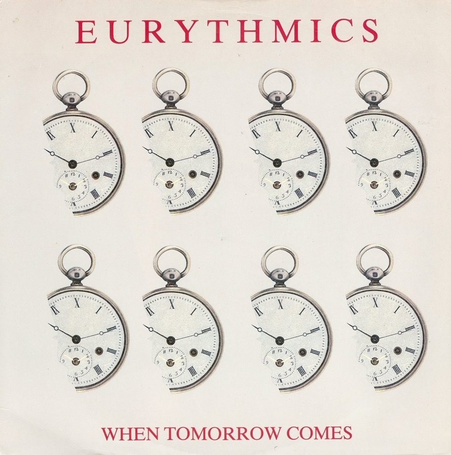
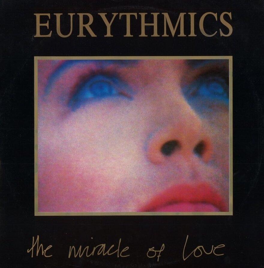
Obviously certain aspects of the paintings that Eric created worked really well, for example, the single sleeve cover imagery of ‘the clocks’ for “When Tomorrow Comes”. I think I used the painting imagery and elements of the various ‘objects’ that Eric produced on three of the four official singles from the album. Only on the cover design for “The Miracle Of Love” single sleeve did we break away from using Eric’s paintings.
Also all of the imagery was used to accompany the “Revenge” tour merchandise and graphics at the time, the tour programme, T-shirts … even down to the “Revenge” badges that you could buy at the shows that were the exact replica of the “Revenge” badge that Dave wears in the painting on the front of the album cover. So I guess you could say that it was a ‘concept’ album sleeve design, but it was never discussed as being a board game, so it’s interesting to hear that comment from you. I guess people do interpret visuals and ideas in their own way, especially paintings, as sometimes we see things differently to what the artist intended at the time.
MARK:
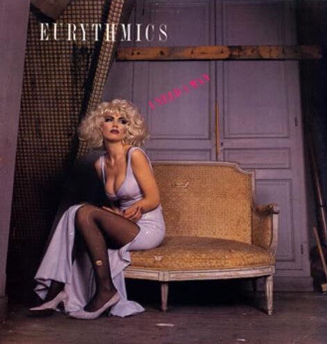
I know you said earlier you didn’t design sleeves for other countries, but the “I Need a Man” sleeve in the U.S. was a great sleeve. Did you have anything to do with it? It’s quite stunning, but it could be Alastair’s great photography that made it shine, as well.
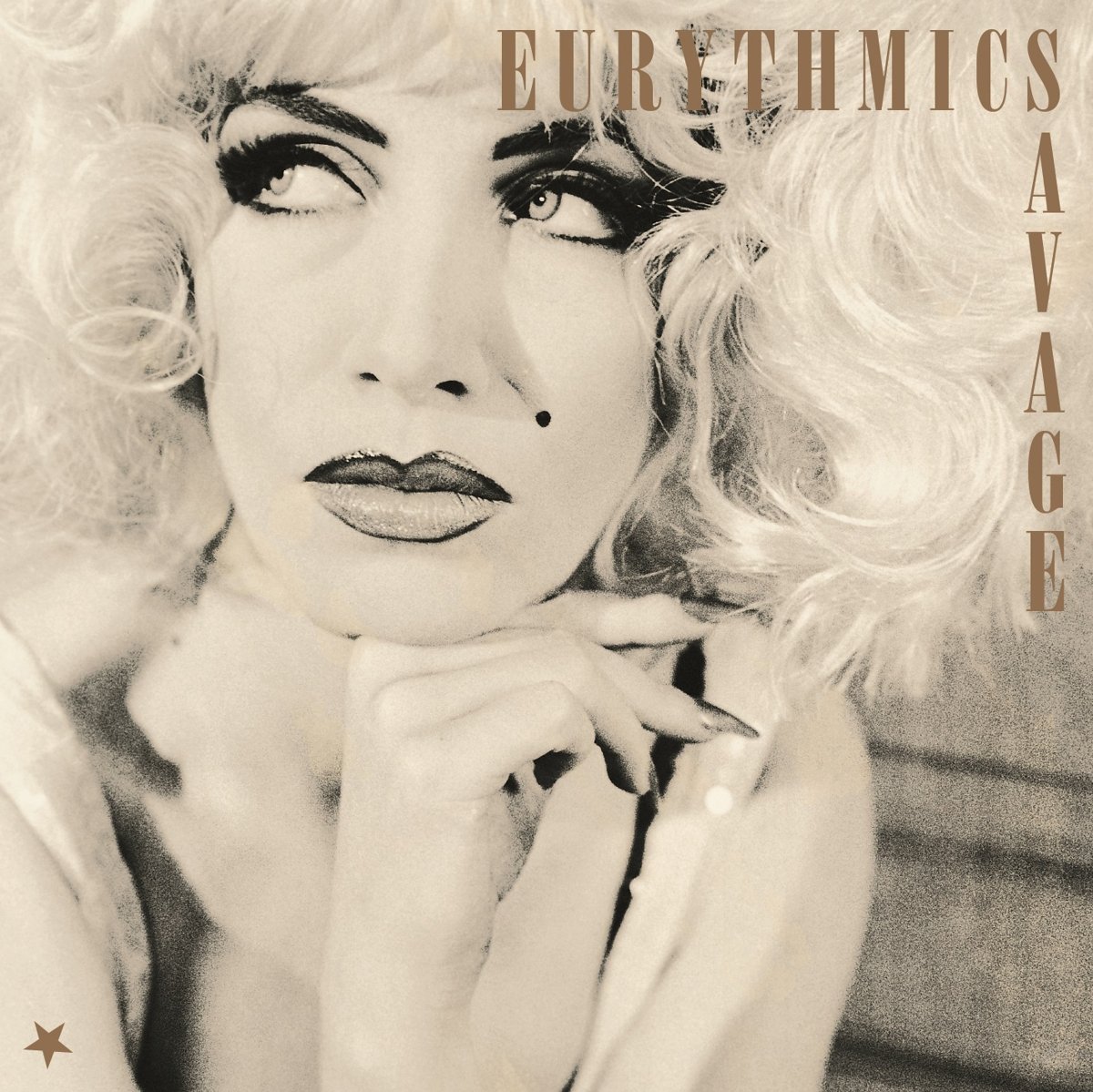
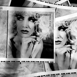
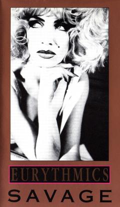
LAURENCE:
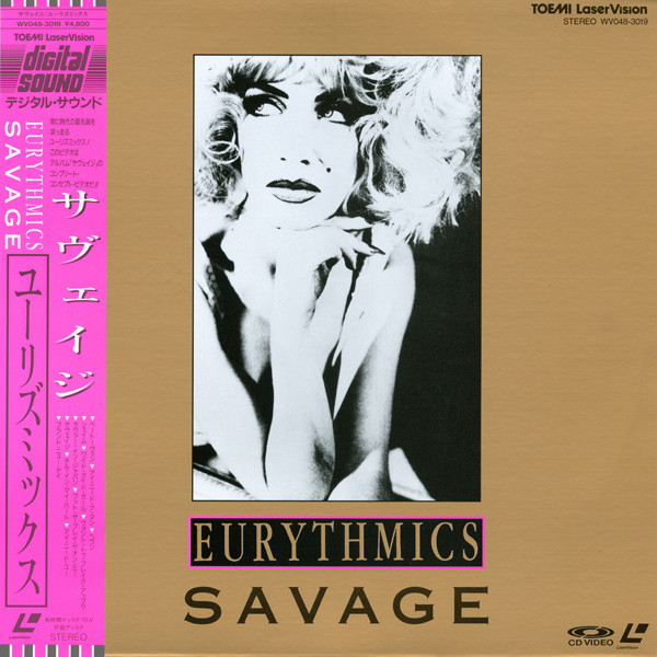
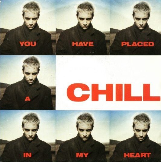
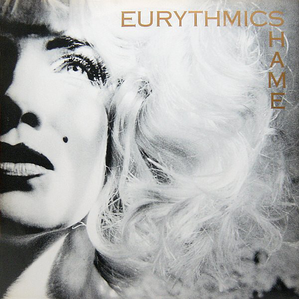
Funny you should mention that sleeve Mark, because I did actually design that single sleeve for the U.S. release of “I Need A Man”. I’m glad that you like it. That was one of a handful of single sleeve designs that I managed to create the worldwide artwork for, across Europe and the U.S., too. Luckily all of the official album cover designs remained the same across the world! I did manage to design all of the related “Savage” album, and respective single release marketing campaigns ‘for the world’ just trying to make sure that [hopefully] each of the territories would all have the same design and artworks for once in the bands’ lifetime. For me, it was really important that with the “Savage” album that it was treated with the same strength of design and creative process that the bands’ other more commercial albums had been. You may recall that at the time, “Savage” wasn’t really as big of a success in the way that “Sweet Dreams [Are Made Of This]” or “Touch” were, quite wrongly in my opinion. So with Alastair Thain’s really amazing images of Annie, I wanted those images to really stand out as the main focus for all of the single sleeve designs too, making the placing of my minimal typography, even more minimal to some extent. You are right in saying that Alastair’s photography for the “Savage” campaign ‘was great’. I totally agree! I loved those images that he took of Annie. The record company didn’t like them at all. In fact the image that I used on the “Savage” album poster design is now in the NPG [National Portrait Gallery] collection here in London which proves just how good those photographs are.
And finally after all this time, the “Savage” album is now treated as a critical success, in fact, a lot of fans tell me that it’s their favorite Eurythmics album. I did win a couple of marketing awards for that album campaign, as well as for the design of the VHS package, because, for a designer, having Alistair’s wonderful images to work with was just a dream!
MARK:
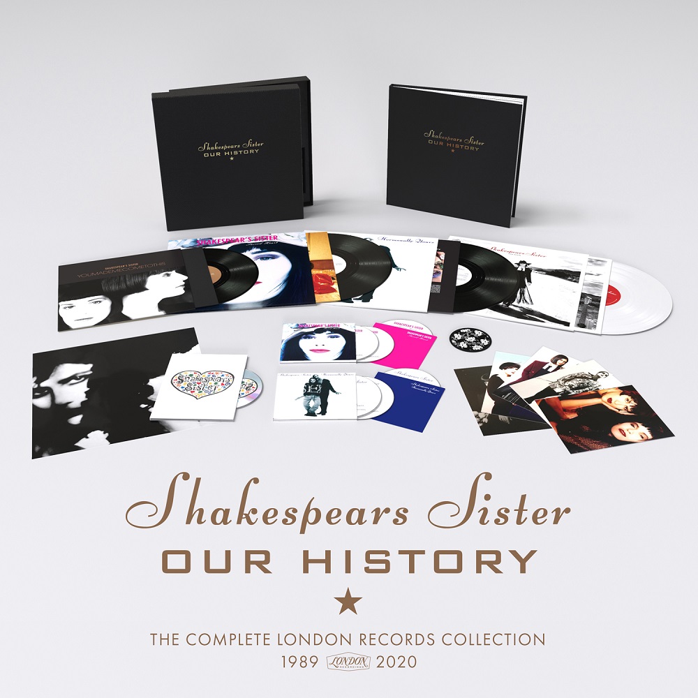
You recently designed the beautiful Our History box set for Shakespears Sister. Would you like to design something similar for Eurythmics? A singles box set? What would you like to do. I’ve always thought an anniversary edition of Sweet Dreams would be wonderful if it were produced in a candy heart box.
LAURENCE:
Yes, the idea of a Eurythmics 7-inch singles boxset, or a 12-inch boxset, or even a singles ‘remix’ boxset has been discussed a few times over the years. I do know that it’s something that the fans would really like to see, and having retained all of the original ‘unseen + unused’ designs, we could def make it an amazing looking project. In fact, when I designed all of the re-issue vinyl sleeves back in 2018, this idea was discussed at length and we got really close to starting work on a ‘singles boxset’. I even had discussions with RCA and the printers that I was working with at the time who were manufacturing the album re-issue sleeves, but, unfortunately, nothing came of it.
Obviously we could create an amazing book as well for the boxset featuring all of those images and design visuals that only myself, Dave and Annie got to see at the time! We’ve even discussed the idea of releasing all of the albums again ‘properly’ on CD. As really the original CD albums were never designed correctly at the time, they were just poor reduced versions of the LP sleeves. So, again, it would be great to create the proper CD sleeves + booklets for each album as it should have been. There are lesser bands, in my humble opinion, that have released boxsets over the years … and Eurythmics haven’t, which does seem very strange to me. I know that I’m a little biased, understandably so, but I do think that if any band is worthy of an amazing looking + sounding boxset it is Eurythmics.
So in answer to your question, yes, it would definitely be something that I’d love to do, but Dave and Annie would have to be involved so that it was a legitimate release with sleeve notes, etc … in order to avoid that typical record company modern way of ‘milking their back catalogue’ for no reason than to make money.
Part 4 of this interview will be published soon on this website. Be sure to check out LSD STUDIO’s new Instagram page here.